Have you heard this “expert” career advice that’s been circulating for the last 20 or so years:
- “Don’t use columns in your resume.”
- “Don’t use visuals.”
- “The ATS won’t be able to read your document.”
As the narrative goes, if your resume uses a remotely modern or creative design, it will instantly go to the digital trash heap. But is that actually true in 2026, or are we still following rules written for software from ages ago?
Well, there’s only one way to find out, so we started testing. We went straight to the biggest job board in the world to see how their actual employer-side dashboard handles complex resume layouts.

Key takeaways
- Recruiters have access to a specific dashboard that converts your resume into a structured list of required qualifications.
- Stylized headers with icons and colors don’t stop the parser from perfectly extracting names, emails, and phone numbers.
- Double-column resumes don’t turn into word salad. The job board's parser maintains a logical hierarchy and maps all skills correctly.
- Visual elements like pie charts and even book icons are ignored by the parser, leaving your core data intact.
- Plain, single-column resumes offer zero technical advantage over creative ones in modern systems.
- A minimalistic resume won’t land you interviews if your content is missing the keywords the system is looking for.
- Display errors are usually browser-related. Even if the visual preview fails, the system likely already scraped your data.
Setting up the resume parsing experiment
To get to the truth, we uploaded various fictional “dummy” resumes, ranging from bold, high-contrast designs to sophisticated double-column layouts. We even included control variables—plain, single-column Word-style resumes—to see if the “safe” versions had an advantage.
If you’re one of those applicants who believes the old-timey legends about the ATS boogeyman, then the results might surprise you. As it turns out, the automated systems don't care about your columns—they care about your content.
The lesson here is that it’s time to stop worrying solely about the algorithms and start optimizing for the humans who actually make the interview calls.
Author’s take
The test environment
To understand how resumes are parsed, you have to look at the same screen recruiters see. For this test, we logged directly into the job board’s employer dashboard.
Before that, we uploaded Enhancv PDFs to see exactly how the platform's backend algorithm translates visual design into structured data.
Let’s focus on the Candidates tab within the employer portal. This is the "Aha!" moment for any job seeker because it reveals the hidden transformation that resumes undergo once they’re uploaded.
When a recruiter clicks "Add applicant" and drops a file into the upload box, the system immediately begins scraping the document for specific fields.
Here’s an example:
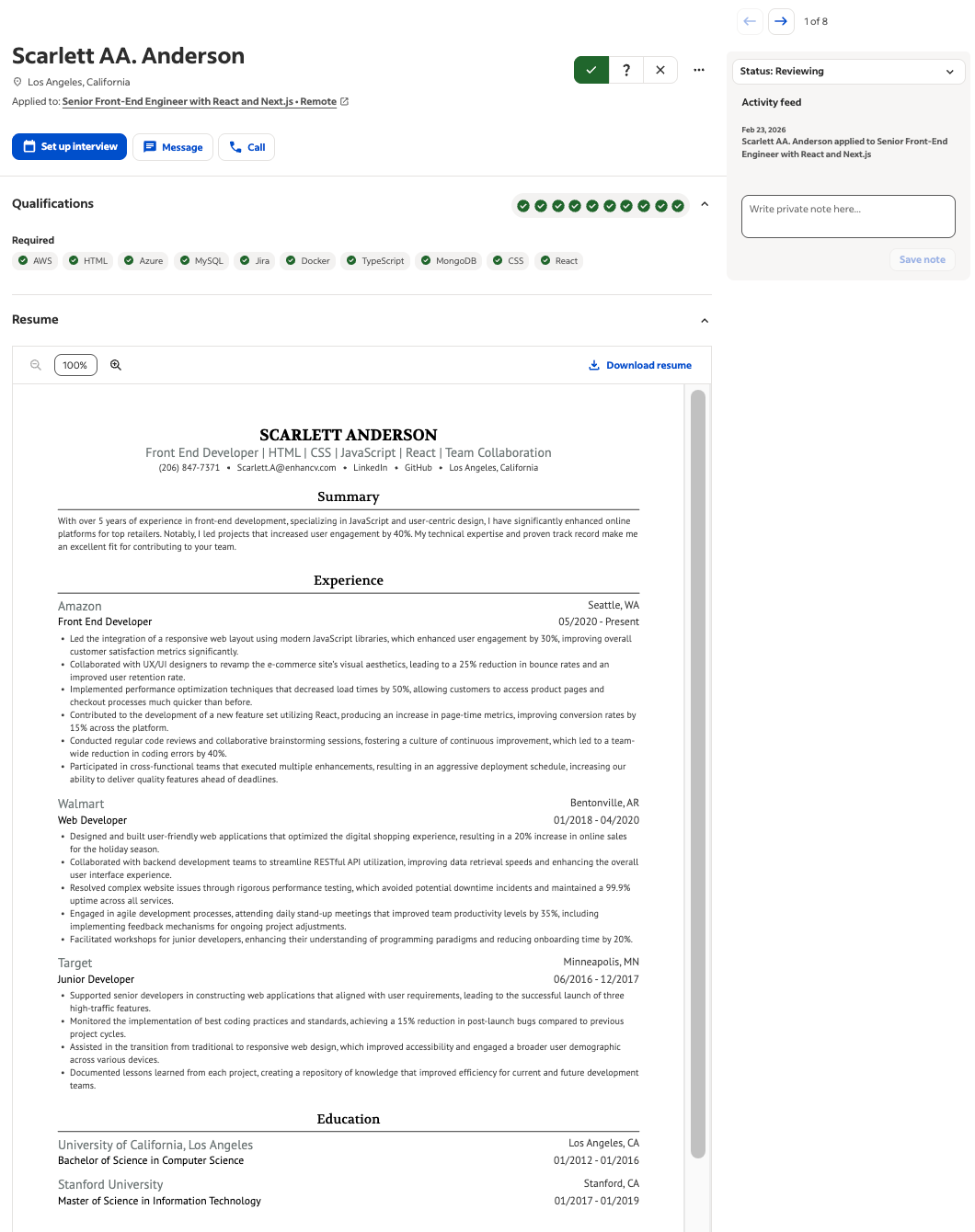
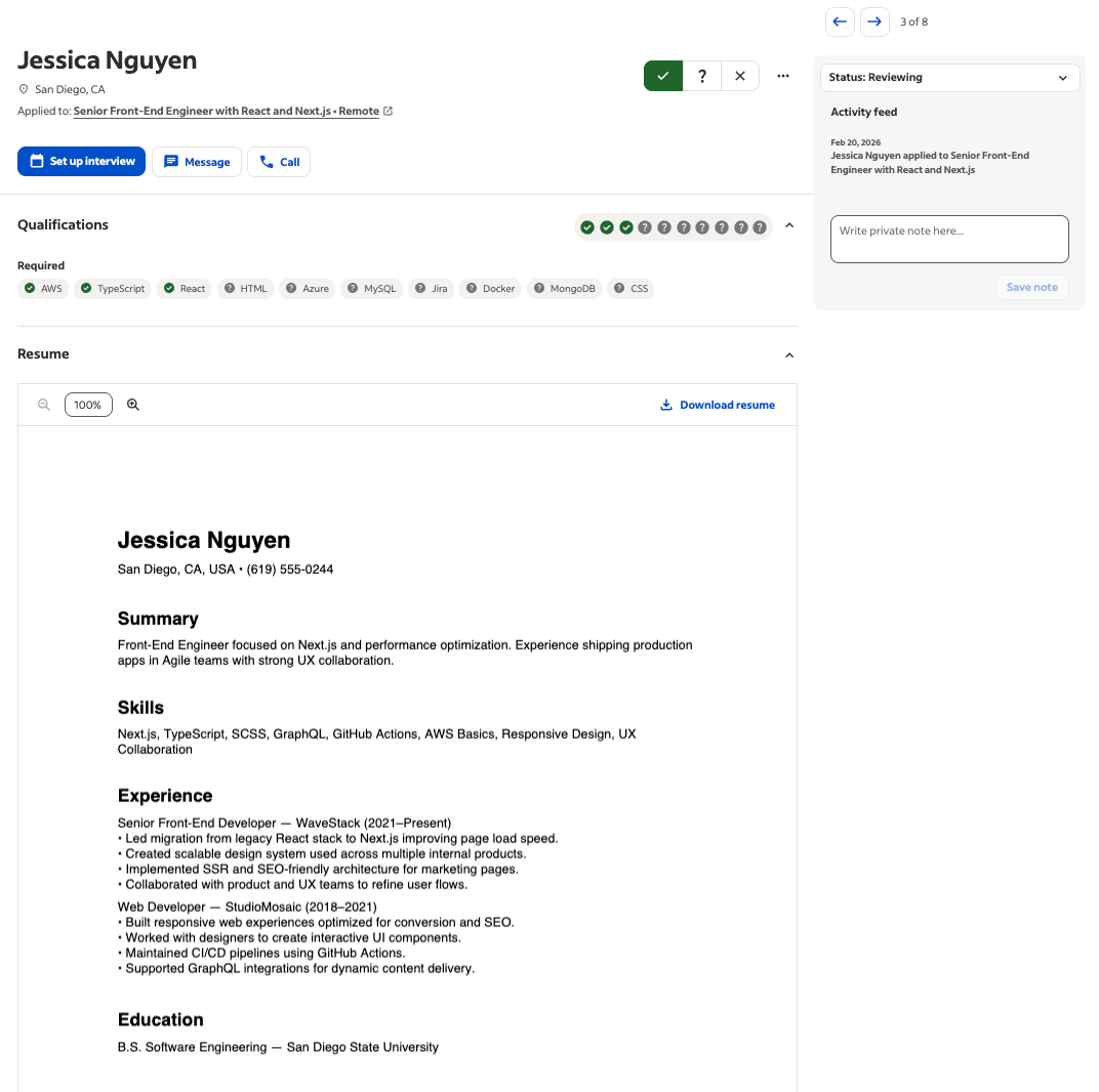
As shown in our initial test with Scarlett Anderson’s profile, the dashboard is designed to highlight "required qualifications." The system is looking for green checkmarks—immediate visual confirmation that the candidate possesses high-priority skills like AWS, Docker, or React.
By using this live environment, we could verify:
- Real-time population: Does the name, email, and phone number appear instantly in the contact fields?
- Skill recognition: Does the system successfully retrieve keywords within a dedicated Skills section?
- Layout integrity: Does the column structure cause the parser to skip crucial work history?
As the screenshot reveals, the resume was parsed perfectly.
Clean data from creative layouts
The first point of failure in many older parsing systems was the resume header. If your name was centered, or if your contact info was tucked into a stylized sidebar, the system would often get confused—leaving the recruiter with a no-name candidate profile.
We put Scarlett Anderson’s high-contrast, modern layout to the test. Despite the bold blue header and the use of icons for LinkedIn and GitHub, the platform’s parser had no issues displaying the resume.
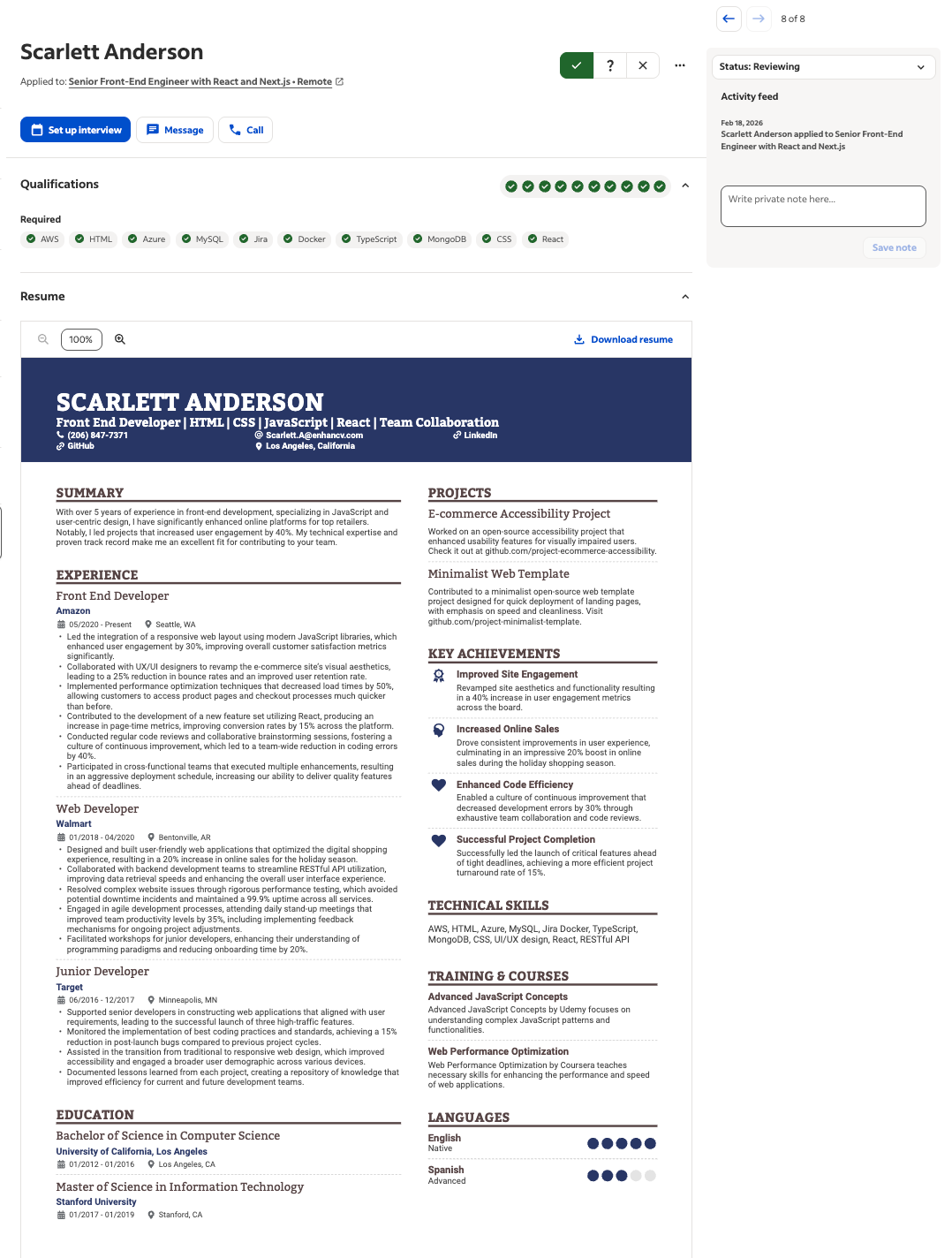
The result: 100% extraction accuracy.
As soon as the file finished loading, the "Review Candidate" screen was populated with perfect data. The system correctly identified:
- Name and location: Scarlett Anderson, Los Angeles, CA.
- Contact sync: The phone number and email address were pulled directly from the stylized header and placed into the actionable "Message" and "Call" buttons at the top of the dashboard.
- Role identification: The job board automatically linked her to the senior front-end engineer position she was targeting.
This proves that modern job boards aren't looking for a plain text document. They are looking for standardized data points. As long as your email looks like an email and your phone number looks like a phone number, the design surrounding them is irrelevant to the machine.
Author’s take
The two-column resume test
Next, we tackled the final boss of resume myths: the infamous double-column layout.
Conventional wisdom says that parsers read resumes from left to right like a book, meaning they’ll mix the text from Column A with Column B, creating a jumbled mess of word salad.
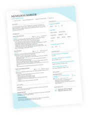
We uploaded Sophia Brown’s resume, which features a heavy left-hand column for her work experience and a right-hand sidebar for Key Achievements and Training & Courses.
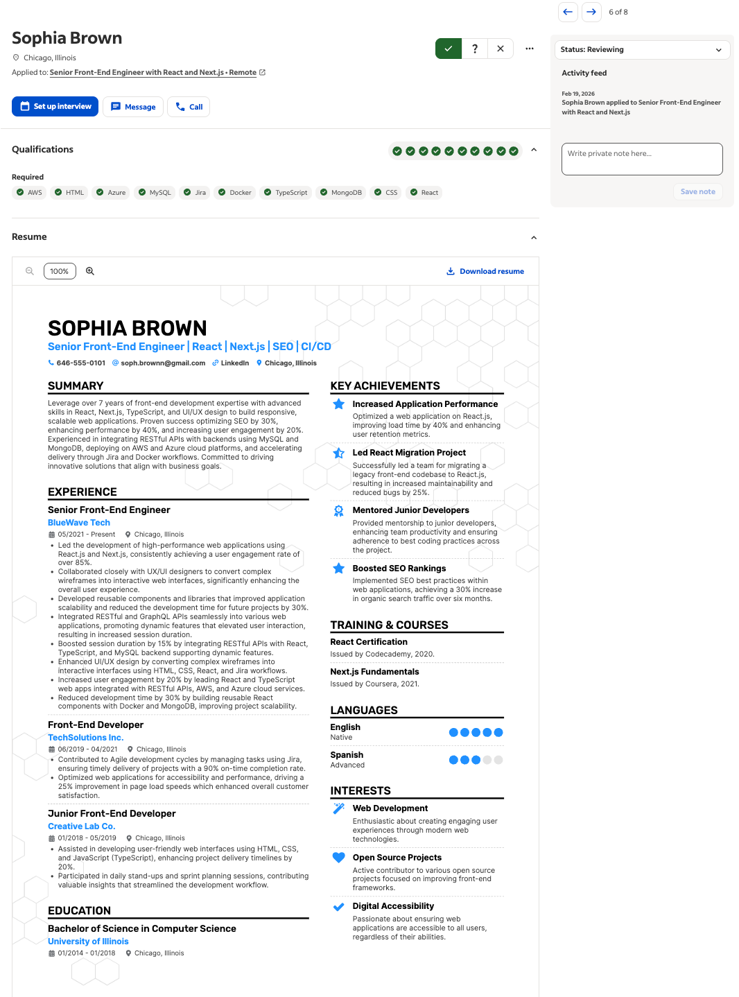
The result: 100% extraction accuracy.
The job board didn't just read the text—it maintained the logical hierarchy.
Let’s break down exactly what happened:
- Work history: The parser successfully separated the senior front-end engineer role at BlueWave Tech from the sidebar achievements.
- Bullet point integrity: The bullet points remained intact, with the dates (05/2021 – Present) correctly assigned to the specific employer.
- Skill checkmarks: Most impressively, the system scanned the technical skills listed in the columns and instantly matched them against the job requirements—giving Sophia a perfect row of green checkmarks for AWS, HTML, React, and TypeScript.
As it turns out, the columns didn't confuse the system. They organized the data for the recruiters.
Testing beyond text (icons, charts, and even books)
One of the most persistent myths is that non-text elements—like progress bars, pie charts, or icons—will confuse the ATS and cause it to skip the surrounding text.
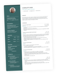
We tested this with Charlotte Jones’s resume, which is packed with visual data: a My Time pie chart, star ratings for languages, and even book cover visuals.
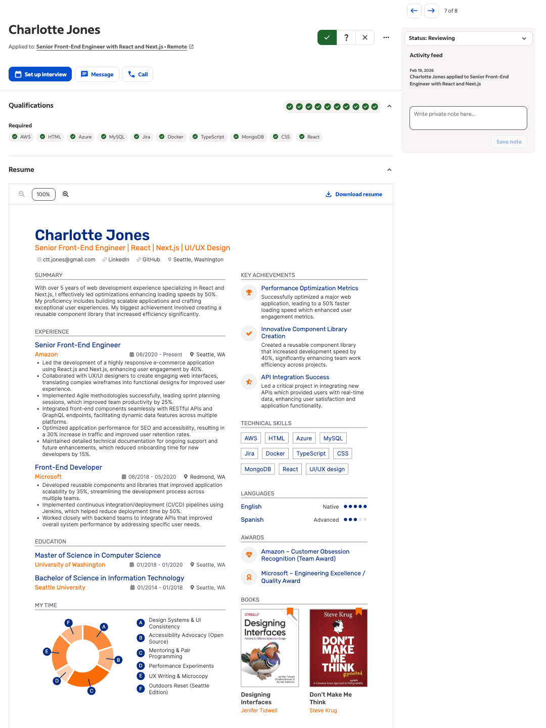
Despite the high density of graphics, the job board’s parser demonstrated remarkable contextual intelligence.
- Graphic bypass: The system successfully ignored the My Time pie chart and book graphics to focus on the text-based data.
- Skill identification: Even with UI/UX Design and React listed alongside icons, Charlotte still achieved a perfect match for all 10 required qualifications.
- Language proficiency: While the star ratings are for humans, the text labels ("Native," "Advanced") were correctly pulled into the candidate's metadata.
The control group (plain text test)
To ensure our creative resumes weren't just getting lucky, we ran a control test using a standard, single-column version of Scarlett Anderson’s resume. This version stripped away the background colors and sidebars to see if the parser’s accuracy changed.
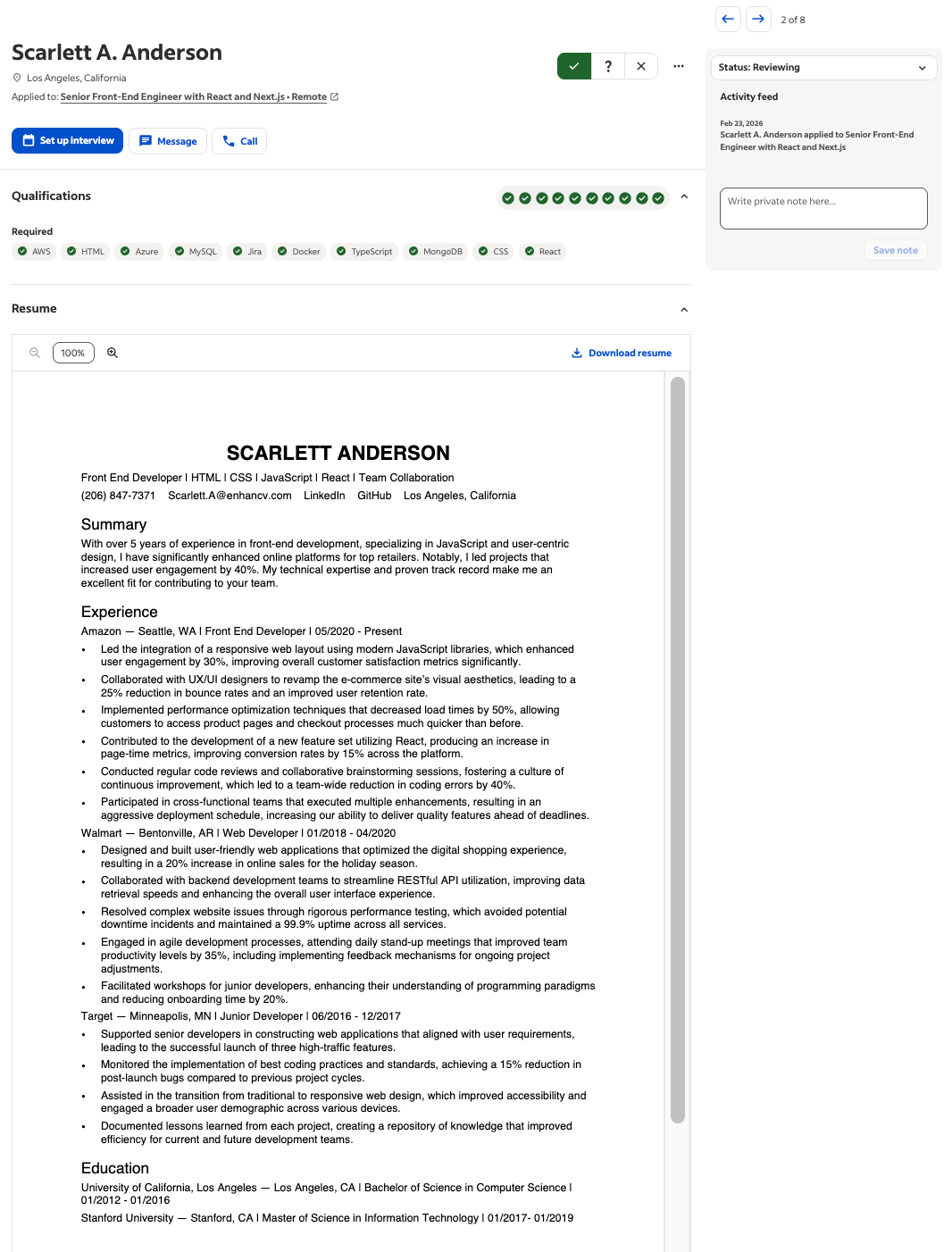
The result: Successful extraction, but visually bland.
The data extraction for the plain version was identical to the creative version.
- Same skills: Both versions triggered the same green checkmarks for AWS and React.
- Same contact info: Both successfully populated the name and location fields.
This confirms that using a boring resume doesn't really give you a technical advantage—it just robs you of the chance to stand out to the human recruiter.
Author’s take
The "bare bones" comparison
We pushed the experiment further by uploading an ultra-minimalist profile. This resume used a classic standard layout with zero decorative elements.
The result: Parsed, but at what cost?
While it was parsed perfectly, it lacked the visual scannability of the Enhancv designs.
Also, did you notice the skill gaps? Several required qualifications remained as gray question marks because their content didn't explicitly mention every single keyword in the job post (like Azure or MySQL).
What we have here is a confirmation that content—not design—is what causes parsing gaps. A plain resume with missing keywords is still a doomed application.
Add Author name and credits here
What happens when displaying fails
During our testing, we encountered a specific scenario where the resume didn't display instantly in the dashboard. For the candidate Jackson Miller, the job board’s interface showed a "We're unable to display this resume on this browser" message.
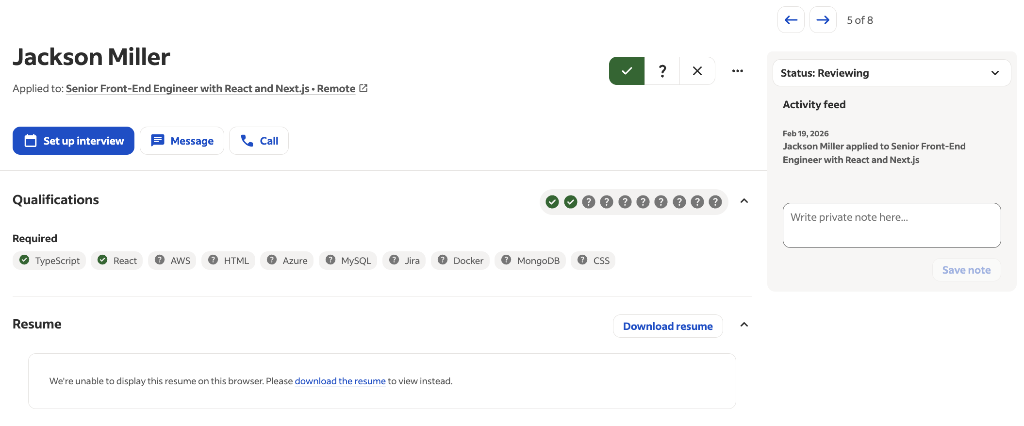
It is easy to look at this and think the design broke the system. But here's the truth behind this error.
Look closer at the Qualifications bar:
- Background parsing: Even though the visual preview failed to load in the browser window, the "robot" had already finished its job.
- Skill detection: The system successfully identified and verified TypeScript and React from Jackson’s file.
These errors are almost always due to browser timeout or PDF encryption settings, not the columns or icons themselves. Even when the human can't see the pretty version, the data is already safely in the database.
Author’s take
Conclusion: Focus on impressing the humans
Our live test on the job board’s employer backend confirms what we’ve suspected for years: the plain-text-only rule is a relic of the past.
Modern job boards are built with sophisticated algorithms that handle sidebars, columns, and icons with ease.
So here’s our final verdict:
- Content is king: The automated systems don't care about your columns. They care about your content.
- Hierarchy matters: As long as you use clear headings and logical sections, the parser will find your data.
- The human advantage: Since the robot can read both a plain resume and a stylised one equally well, why wouldn't you choose the one that actually impresses the human reader?
Don't let outdated myths keep you in the boring plain-text-resume box. Optimize your content for the robots, but design your story for the humans who will hire you.
Make one that's truly you.