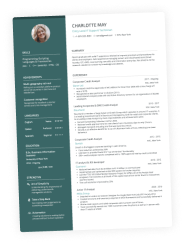
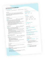
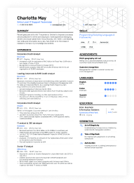
Resumes are designed to make an impact at first glance. Does this look like the right candidate? Are the right skills jumping off the page? These are the quick, almost subconscious questions recruiters ask when your application lands on their desk.
Where does color come into the conversation? Well…
Hiring managers often favor resumes that show creativity in line with the role they’re hiring for. Thoughtfully chosen colors can help you truly distinguish yourself from other candidates.
But there’s a fine line between creative and over-the-top. Used poorly, color on your resume can come across as gimmicky and distracting, potentially derailing your chances.
In this article, we’ll dive into how to use color strategically to enhance your resume, share examples of what works (and what doesn’t), and help you avoid common pitfalls.
Key takeaways
- Thoughtful color choices can highlight key sections, showcase creativity, and underline cultural fit with the company.
- Stick to clean, contrasting palettes that enhance readability without overwhelming or complicating automated tracking systems.
- Use the same color scheme across your resume, cover letter, and portfolio to create a unified, memorable personal brand.
- Consider industry norms and color psychology to select tones that align with the role—like blue for tech or green for healthcare.
- Skip neon colors or clashing palettes that can distract recruiters or compromise accessibility.
Should you use color on your resume?
Yes, using color on a resume can be a great idea—but only when done with intention. A subtle, professional tone can direct attention to key sections like your name, headings, or achievements, helping recruiters quickly spot what matters most.
When used sparingly and with intent, color adds personality and polish, making your resume more noticeable without overwhelming the reader.
How resumes are scanned today and where color fits in
Below are the three main reasons why color is important for crafting a winning resume.
- Recruiter habits: Resumes are often scanned in seconds, with recruiters looking for relevant skills, job titles, and qualifications at a glance.
- Applicant tracking systems (ATS): Many resumes are first processed by software that prioritizes readability and keyword matching.
- Attention hierarchy: Effective color use, like bold headings or sleek resume lines, creates visual cues that guide the recruiter’s eye to important details.
In the sections ahead, we’ll show you how to use color strategically while keeping your resume ATS-friendly and recruiter-approved.
Meanwhile, check how your current resume would perform against a real ATS using our free resume checker.
Is your resume good enough?
Drop your resume here or choose a file. PDF & DOCX only. Max 2MB file size.
The benefits of including color on your resume
Let’s explore why it’s okay to use color on your resume and how it can enhance its impact while keeping it reader-friendly.
Demonstrate culture fit
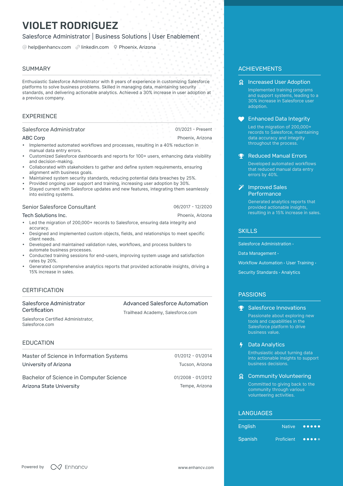
A great advantage of adding a pop of color to your resume is the chance to showcase cultural fit. For example, by choosing a color scheme that reflects the brand of your potential employer, you signal an understanding of their values and identity.
While it won’t secure the job on its own, it’s the kind of extra effort that can set you apart.
Look at this color-coordinated Salesforce resume:
PRO TIP
With Enhancv’s resume builder, you can customize your resume to match a specific brand palette by simply entering the exact hex code. This ensures your colors align perfectly with the company’s branding.
However, use this technique carefully—at larger companies, recruiters might receive dozens of resumes with the same idea. For a unique edge, this approach works best when applying to smaller companies where personal touches stand out more.
Direct attention
When crafting your resume, ask yourself: what are the three key takeaways I want recruiters to remember about me?
We all have career highlights that deserve attention, and we want recruiters to immediately see how we align with the job description. By using color strategically, you can emphasize the most important parts of your resume—whether it’s specific sections, headers, or even keywords. It’s a simple yet effective way to help you grab attention and enhance memorability.
ATS compatibility
A common concern when designing a resume is whether it will pass through ATS. These tools are primarily used to store, manage, and screen applications for specific keywords rather than directly reject resumes.
Worry not, color itself doesn’t affect your resume’s performance in ATS. Enhancv’s resume templates are thoughtfully designed with ATS-friendly tones and hues, so you can stand out without risking readability or compatibility issues.
Check out the latest addition to our range of modern resume designs for inspiration.
Enhanced accessibility
Using color thoughtfully can make your resume more accessible to all readers. High-contrast color combinations, such as dark text on a light background, improve readability and ensure your resume is clear for people with visual impairments or color blindness.
By prioritizing accessibility, you not only create a user-friendly design but also demonstrate inclusivity—an increasingly valued trait in today’s workplace.
Modern design trends
Incorporating color into your resume reflects an awareness of current design trends, signaling creativity and adaptability. A well-designed resume with a modern touch can help you stand out, especially in industries that value innovation and originality, such as creative and cultural fields.
While adding color to your resume can offer plenty of benefits, it’s not without its challenges—let’s talk about the potential limitations to keep in mind.
The drawbacks of using color on a resume
While the pros and cons of colors on your resume are worth weighing carefully, understanding the potential downsides can help you make smarter design choices that enhance your chances rather than hurt them.
Gimmick overload
Recruiters appreciate resumes with chromatic elements enhancing the design, but going overboard with clashing combinations or excessive variations can backfire. Overuse of color can come across as gimmicky, giving the sense you’re trying to distract from a lack of experience or skills—definitely not the impression you want to leave.
Compromised readability
Using the wrong colors can make your resume harder to read, especially when printed on certain types of paper or viewed on different screens. Very bright or low-contrast colors might not display as intended and can strain the recruiter’s eyes.
Potential industry mismatch
In certain fields—like law, publishing, or academia—a clean, black-and-white resume is often the preferred standard. These industries tend to value professionalism and simplicity over creative flair. Adding color might come across as overly casual or out of place, so it’s better to stick to classic formatting in these cases.
If you’re unsure, research the company’s culture or check examples from your field to see what’s typical. When in doubt, keeping it monochrome is always a safe bet!
Understanding the basics of color theory can help you choose hues that not only look great but also align with the message you want your resume to convey.
Let’s dive into a quick lesson!
A quick lesson in color theory
Recruiters are human, and they perceive color just like the rest of us. By applying thoughtful design principles, you can guide their eyes to the most important parts of your resume.
Here are five color theory rules to consider:
Contrast
Always ensure your text color contrasts strongly with the background for maximum readability. Avoid combinations like yellow on white or neon green on gray—these can strain the eyes and make your resume hard to read.
Stick to high-contrast, professional tones to ensure your file is recruiter-friendly.
Best practices for optimal contrast
- Dark text on a light background: Black or navy text on white or ivory.
- Accent colors with balance: Deep green or burgundy text paired with a light neutral background.
- Charcoal gray on creamy paper: A modern alternative to black-and-white maintaining excellent readability and a refined look.
Hierarchy
Visual hierarchy refers to how design elements guide the viewer’s eye, indicating what to read first, second, and so on. The right color combination helps you create a clear hierarchy on your resume, making it easy for recruiters to navigate and focus on the most important details.
Here’s how to structure your palette choices:
- Primary color: This is your standout shade, used for key elements like your headline and section names. It grabs attention and anchors the reader’s focus.
- Secondary color: A complementary but less dominant shade. It organizes content and highlights secondary details like icons or subheadings.
- Accent color: A subtle, artistic touch that adds personality and polish without overwhelming the design.
PRO TIP
Avoid using colors with equal dominance or saturation. When colors fight for attention, HR won’t know where to look first. Instead, ensure your palette works together to lead their eye naturally from one section to the next.
Context
You might wonder: What are the best colors for a resume? Unfortunately, there’s no one-size-fits-all answer. Designing a resume requires creativity and originality, and the "right" colors depend on the context of the job and the company.
The rule of thumb is simple
Don’t just pick a color you like and hope the hiring manager shares your taste. Your resume is about them, not you. To choose the best tones, think about what aligns with the particular industry and company culture.
Concrete examples for different industries
- Healthcare: Green conveys growth, calmness, and a connection to health and nature—ideal for nursing, therapy, or medical roles. Go for deep forest green or soft sage, set against an ivory backdrop.
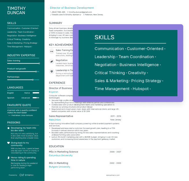
- Tech and engineering: Blue signifies trust, reliability, and innovation, making it a popular choice for web developers, software engineers, and IT professionals. From navy to light steel, this timeless favorite is always a safe bet.
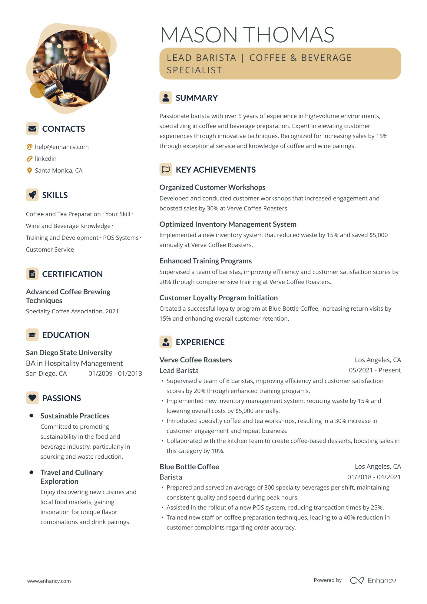
- Sports and athletics: Orange exudes energy, enthusiasm, and motivation, perfect for fitness trainers or athletic coaches. Consider combining burnt orange with warm beige and light gray.
- Creative industries: Bold, vibrant colors like teal or magenta can reflect originality and confidence for designers, marketers, or writers. Enhancv’s pre-made color combinations feature teal, pale aqua, and soft gray tones for maximum versatility.
These are just starting points. You can experiment with different tones as long as they’re professional, cohesive, and aligned with the company’s values.
PRO TIP
Before finalizing your design, check out resumes from others in your field to see common trends. This ensures your resume feels fresh while still fitting industry expectations.
Consistency
Ever wonder why successful companies rarely change their brand colors? It’s all about recognition. Big companies invest millions in creating visual identities and changing their looks could undo that effort. They want you to associate their products and services with specific colors instantly—so they stick with them.
Now, what does this mean for your resume?
Think of yourself as a brand and act like one. Use consistent colors across your resume, cover letter, portfolio, and even your business card. This unified approach not only helps you stand out but also keeps you memorable in the recruiter’s mind.
Here’s the bonus—consistency in your palette subtly showcases your attention to detail and creativity, even on a simple resume. It’s a professional way to make a lasting impression.
Combination
When given the chance, many applicants get carried away and use too many colors, thinking it will make their resumes pop. But the reality? Overloading your resume is often seen as a red flag.
It’s because some color combinations aren’t visually appealing or cohesive. When tones clash, they confuse the recruiter’s eye, making it harder to focus on key information. The last thing you want is for a hiring manager to struggle to decide what to read next.
Here’s how to keep it clean:
- Stick to a simple palette—no more than two or three colors.
- Use the same color for grouping similar elements, like section titles, lines, or paragraphs, to create a sense of order.
- Focus on complementary combinations for visual harmony. For example, blue and orange work well together because they balance each other out.
Keeping your colors cohesive and purposeful ensures your resume remains professional and easy to navigate.
Next, we’ll help you pick the perfect colors for a resume that’s tailored to your target job and personal brand.
Three steps to choose the best color for your resume
Follow these simple steps to design a resume that’s both stylish and professional.
Step 1. Select your primary, secondary, and accent colors
To grab the recruiter’s attention without appearing overdone, stick to the guidelines below:
- Your primary color should highlight the most important elements, like section headers or your name.
- The secondary color complements the primary tone and organizes additional content, such as subheadings or contact information.
- The accent color is optional and mainly used for links, icons, or lines.
Here’s how these adjustments look with Enhancv’s color picker:
Step 2. Match your cover letter
Consistency is crucial, especially when it comes to using color in your application. A vibrant, colorful resume paired with a plain black-and-white cover letter creates a disconnect.
Make sure your color scheme flows seamlessly across all materials you present to the recruiter. This cohesive approach looks professional and reinforces your personal brand.
Step 3. Consider resume paper
For some of you, having a physical copy of your resume is essential. Whether it’s for an in-person interview, a networking event, or simply to hand over during a meeting, a printed resume can leave a strong impression.
Before printing, always download your resume as a PDF to preserve the formatting and ensure all elements, including your colors, look exactly as intended. Once you’re ready to print, consider the type of paper carefully.
The best color for resume paper is standard white or ivory. These allow your graphic elements to shine without distortion. On the other hand, darker or tinted paper—like black, blue, or pink—can muddle your design and make it harder to read. Stick with clean, neutral tones to ensure your resume looks good in any setting.
PRO TIP
Use pre-approved resume color schemes to ensure your design passes ATS screening seamlessly and remains recruiter-friendly.
Frequently asked questions on resume colors
Here are the top concerns about keeping your resume professional while still adding a little bit of “you.”
How does formatting affect your color choices on a resume?
Formatting and color go hand in hand when designing a resume. Using formatting best practices ensures your resume designs enhance readability and maintain a sleek appearance without overwhelming the layout.
Let’s explore how to align your formatting with your color scheme for the best results.
- Stick to a clean layout: Use consistent margins, spacing, and alignment to keep your resume easy to read.
- Limit your color palette: Choose two to three complementary colors to maintain a cohesive look.
- Be ATS-friendly: Avoid excessive graphics or overly bright colors that may not scan well.
- Keep fonts simple: Stick to professional, legible fonts, and use color sparingly for font variations, like bold or highlighted text.
- Test print your resume: If you need a physical copy, print it on neutral paper to see how your colors appear in real life. Adjust if necessary for better clarity.
What is color psychology?
Color psychology is the idea that colors can influence how people feel or think. Different colors send different messages. For example, blue feels trustworthy, green is calming, and red grabs attention.
When it comes to resumes, color psychology helps you choose tones that match your personality and the job you’re applying for. It’s all about creating the right impression without saying a word.
Here are some examples:
- Blue: Trustworthy, reliable, and professional—great for corporate or tech roles.
- Green: Calming and associated with growth—perfect for healthcare or environmental industries.
- Red: Bold and attention-grabbing—ideal for creative roles or sales positions.
- Orange: Energetic and enthusiastic—suited for sports, fitness, or marketing jobs.
- Gray: Neutral and balanced—works well for traditional industries like law or finance.
What’s the best color for text on a resume?
The best text color for resumes is usually black or dark gray. These are easy to read and look professional on both screens and paper.
What’s the best color palette for a formal resume?
For a formal resume, stick to neutral and professional tones. Black, dark gray, or navy blue are great for text, paired with white or light gray backgrounds.
Keep it simple and classy to match the tone of traditional industries.
What colors should you avoid on a resume?
Stay away from overly bright or neon colors like hot pink, lime green, or bright yellow. These can be distracting and make your resume hard to read.
Also, don’t add too many colors at once or combinations that clash, like red and green or orange and purple. The goal is to look professional, not overwhelming.
Should you use color in your cover letter?
Yes, as long as it matches the color palette of your resume. For example, use the same accent color for your name or section headers.
Avoid going overboard—your cover letter should still feel professional and easy to read, with the focus on your words, not the design.
Conclusion
Your resume should showcase your personal brand from the very first glance. Be strategic with your color choices and use our guidelines to tailor them to your target role and industry.
Make one that's truly you.

