Even before a candidate’s resume lands on a hiring manager's desk, it has to pass through a lot of hoops, the digital gatekeeper known as an Applicant Tracking System (ATS) being the most dreaded one.
There is a plethora of myths circulating about how those systems work—such as the notion that ATS systems are incapable of processing double-column resumes, reject PDF file formats outright, or are incompatible with resumes featuring infographics. Such misconceptions can lead to unnecessary anxiety and hinder the jobseekers’ strategic approach to job applications.
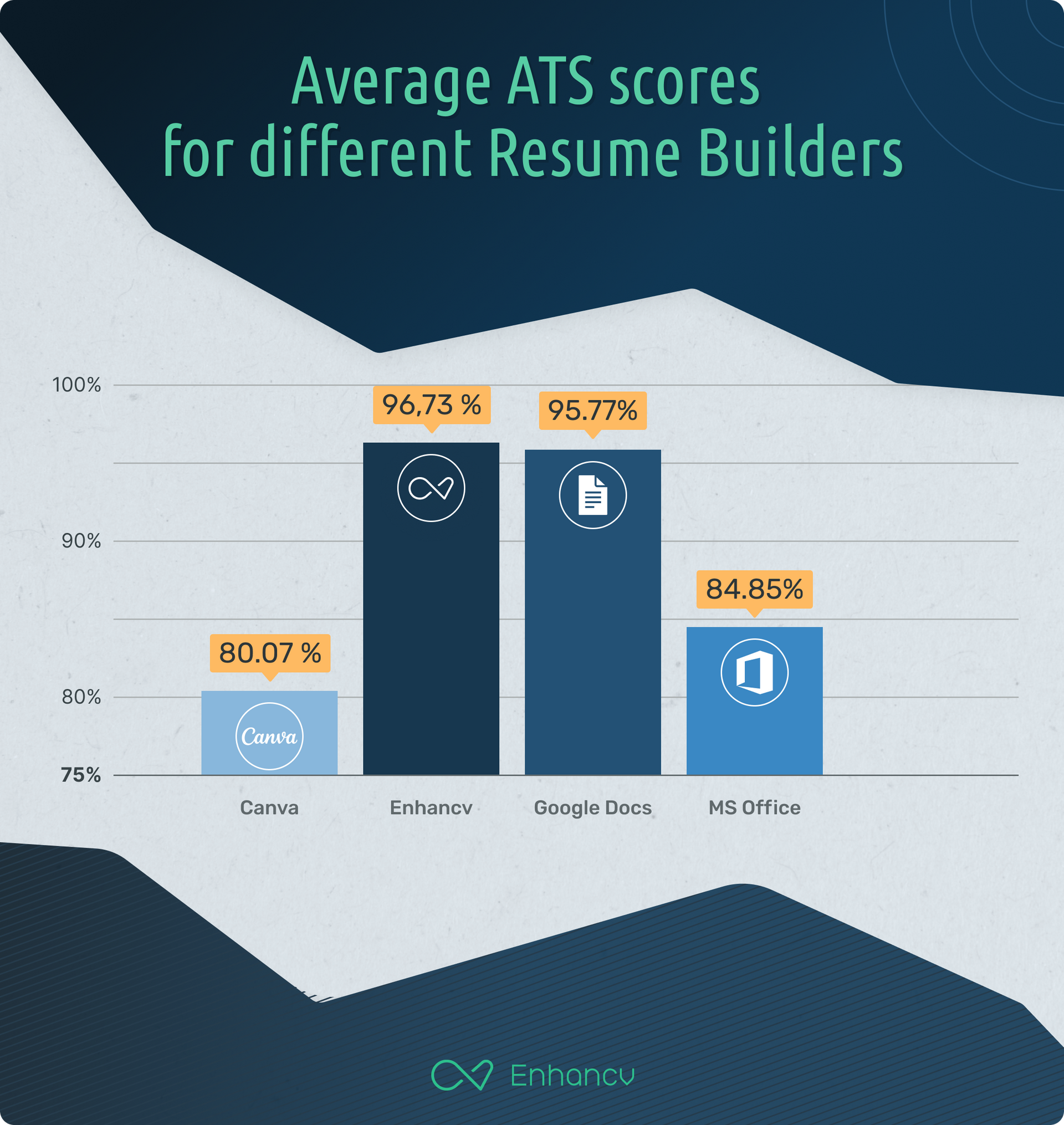
To address the various concerns surrounding the effectiveness of different resume formats and templates in passing through Applicant Tracking Systems, we undertook a comprehensive research project aimed at separating the myths from the realities. Utilizing a variety of the most popular ATS systems available in the market, we tested several widely used resume-building platforms to provide an impartial evaluation of their performance. This included mainstream tools like Google Docs and Microsoft Word, general-purpose design-centric software Canva, as well as a specialized resume-building platform - our very own Enhancv.
We included our own product, Enhancv, in this research for a couple of crucial reasons.
First, we believe in the efficacy and quality of our own platform, and we thought it was essential to see how it stacks up against other well-regarded solutions.
We are committed to transparency and continuous improvement, and including Enhancv in the test allows us to identify areas for enhancement based on empirical data.
Second, by including Enhancv in an impartial research setting that also evaluates competitors, we are promoting a level playing field that enriches the integrity of our study.
It's important to note that this research was executed using an external ATS system to maintain the objectivity of the results. Our belief in our product is grounded in its design, features, and the value it offers to job seekers, but we recognize the importance of substantiating these qualities through rigorous, independent testing.
By examining ATS scores and parsing capabilities across these various platforms, we aim to provide concrete insights that can guide users in choosing the most effective tools for their job application processes.
Here are some of our findings:
- The ATS scores for resumes built with Canva range from 52% to 92%, showing some inconsistencies in how well these resumes may perform in automated tracking systems. Still, on average, Canva scores the lowest in average in all the categories.
- Google Docs templates have the highest overall ATS scores ranging from 92% to 99%, which indicates a high level of compatibility with Applicant Tracking Systems. This makes them a strong choice for those who are applying for jobs and want to ensure their resume gets properly scanned and recognized by such systems.
- Generally, resumes with a single column performed equally well compared to those with double columns in terms of ATS score. However, in certain specific categories, two-column resumes got 100% in almost all fields, indicating that having two columns does not necessarily disadvantage a candidate.
- Both modern, graphic-rich, and simple designs performed well in the ATS scoring. It indicates that the choice between a modern and a simple design may be more a matter of personal preference or industry norms rather than a technical constraint enforced by the ATS.
- The ATS seems to handle both the PDF and DOC files with similar outcomes.
- Resumes created using MS Office displayed mixed results. Some scored 100% across all metrics, while others like "Bold modern resume" had a score as low as 36%. This suggests that the effectiveness of using MS Office for resume creation may depend heavily on the specific template used.
Is your resume good enough?
Drop your resume here or choose a file. PDF & DOCX only. Max 2MB file size.
How do applicant tracking systems (ats) work
Imagine you have hundreds of resumes for just one job posting; it's a mess to sort through all of them manually. That's where an ATS comes in. It takes all those resumes, reads them, and puts the info in a database so it's easy to search and organize, all to find the best candidates.
When sourcing for an open position, recruiters can use it to post job openings, go through resumes quickly, set up interviews, and even check some stats on how well your hiring process is doing. It makes the whole "finding the perfect employee" thing a lot less of a headache, which comes even more handy for large companies.
Basically, it's a one-stop shop for all hiring needs for the recruiting teams,
Many ATS systems also come with additional features such as automated resume screening, interview scheduling, and analytics to help companies understand their hiring processes better. Some systems integrate with other HR software for a more seamless employee onboarding experience once a candidate is hired.
Typically, when a job seeker applies for a position, their resume and application materials are uploaded into the ATS. The system then parses the information and stores it in a database. Recruiters and hiring managers can then search the database using keywords, skills, educational background, experience, and other filters to find candidates who match the job requirements.
Understanding how an ATS parses resumes is crucial for job hunters.
It's looking for specific keywords, skills, or experience that match the job description.
If the resume doesn't have what the ATS is programmed to find, it might get skipped over, no matter how qualified a person is.
That’s the reason why many job applicants try to "game" Applicant Tracking Systems to increase their chances of landing an interview.
As stated before, these systems automatically filter and rank resumes based on specific keywords, qualifications, and other criteria set by employers, so the people are basically trying to beat the computer at its own game.
As a result, people might resort to tactics like sticking to specific resume templates, avoiding infographics, or keyword stuffing—inserting relevant keywords or phrases excessively or out of context—in their resumes to pass through the system's initial screening.
Others may use creative formatting or designs that they believe will make their resume stand out, although this cansometimes backfire since some ATS software struggles to accurately read unconventional layouts.
The attempt to outsmart applicant tracking systems reflects the often frustrating and opaque nature of automated hiring processes. Still, it also poses ethical questions and can result in a poor fit between the candidate and the job role.
It's a risky strategy that may offer short-term gains, but often at the cost of long-term career success and credibility. And, more importantly, very often is based on urban myths that have little to do with reality.
Researching the most common ATS myths
There are many myths circulating about how these systems work and how to "beat" them.
We decided to tackle some of the most common misconceptions about ATS systems, backed by research and evidence, to set the record straight.
There's a lot of folklore about what Applicant Tracking Systems can and can't do, very often causing needless stress and missteps for job seekers.
Among the most talked-about myths are the belief that ATS systems can't handle double-column resumes, that they reject PDF formats, and that infographics will doom your application straight to the reject pile.
Myth 1: ATS Don’t Read Double-Column Resumes Well
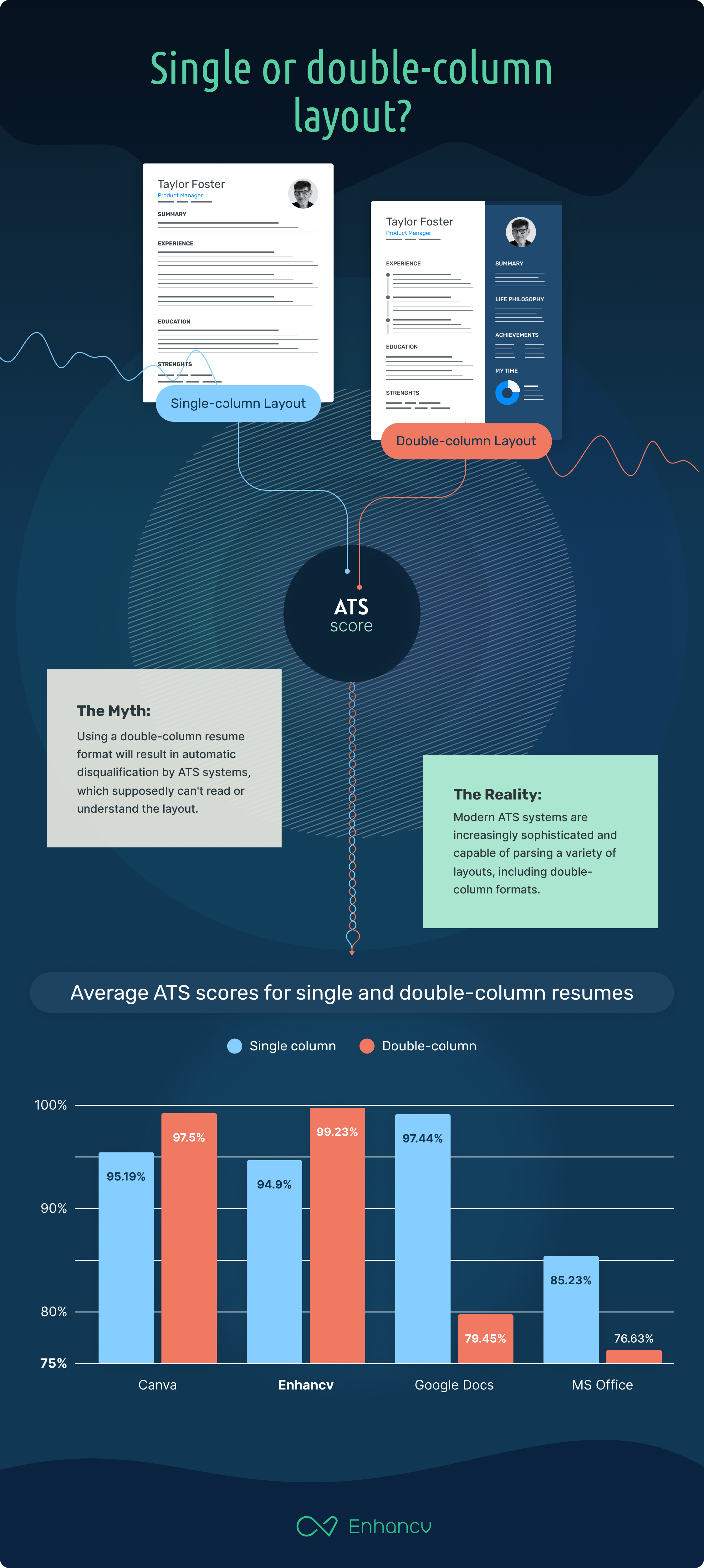
The Myth: Many job seekers have heard that using a double-column resume format will result in automatic disqualification by ATS systems, which supposedly can't read or understand the layout.
The Reality: Modern ATS systems are increasingly sophisticated and capable of parsing a variety of layouts, including double-column formats. Our study showed that the most popular ATS systems are fine with scanning and interpreting double-column resumes.
However, the key is to ensure that the important information—like your contact details, experience, and education—is easily accessible and not buried within the layout.
- Single-column templates fare overall a bit better than double-column, with average scores of 93% for single-column and 86% for double-column.
- When researched in detail, the findings seem far less obvious - while still true for resumes built with MS Office and Canva, the data is reverted for Google Docs and Enhancv, both having surprisingly scored higher with resumes with double-columns than with single-column designs. Ehnancv scored 95% with single-column designs and 98% with double-column, and Google Docs 95% and a staggering 99% with single and double-column designs respectively.
Single-column layouts usually perform well, but they have some instances where the 'Location' and 'Linkedin' scores are 0%, affecting the overall ATS score.
Double-column layouts also perform well overall, especially those from Enhancv and Google Docs. However, some from MS Office and Canva showed drastically lower scores, pulling down the average for double-column layouts.
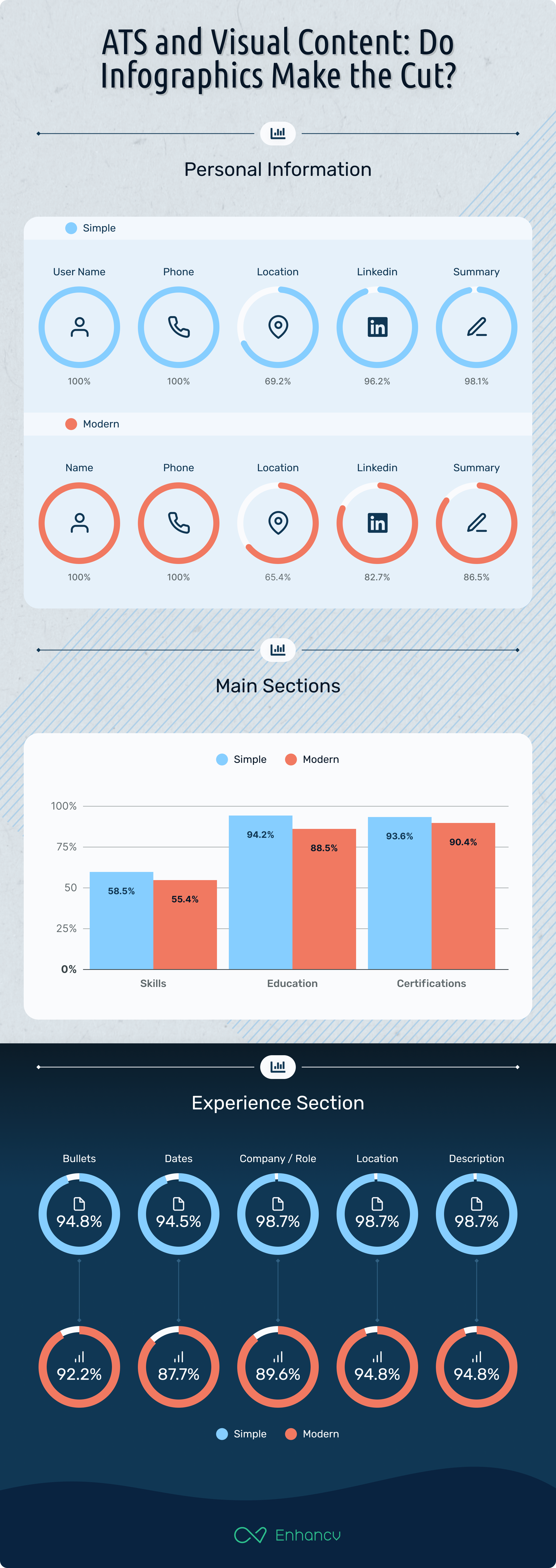
The ATS struggled the most in all researched cases with parsing the skills sections of the resumes. On average the parse rate for the skills section for single-column resumes was 65%, while with the double-column resumes was only 46%.
Both layouts also had issues with having the ‘location’ part of the resume header parsed, but surprisingly double-column resumes scored better than single-column ones.
However, where double-column templates fell short was the parsing rates of LinkedIn information and candidate summary/objective, with only 82% and 89% being correctly parsed, as opposed to 100% and 97% respectively when the single-column template was used.
A similar situation occurred with parsing the ‘Education’ and ‘Certifications’ sections. Single-column templates scored almost 100%, while double-column ones only scored 88% and 86%.
Overall, single-column templates perform slightly better than double-column layouts.
However, we wanted to dig a bit deeper.
So–
After a closer inspection and limiting the outcomes to Google Docs and Enhancv, we noted that, in some cases, double-column layouts scored higher than single-column ones.
The readability of single-column resumes was at 95%, while, surprisingly enough, the double-column layouts scored at almost 98%.
The biggest challenge and what subsequently lowered the scores for the single-column templates was parsing the ‘Location’ section from the resume header, scoring as low as 75%, compared to 89% in double-column layouts.
The skills put on the resumes were also not fully parsed, reaching 85% parse rate for single-column resumes and 81% for double-column layouts.
Keep in mind that these are the results of limited research conducted on best-performing resume-building software selected from the previous outcomes, beings Google Docs and Enhancv. The conclusion is - if the software was built or optimized for resume building and ATS in mind, like Enhancv, there is little to no difference in parse rates between single- or double-column layouts. In other cases, it’s still best for the jobseekers to stick to using single-column templates.
Myth 2: ATS Don’t Work Well With PDFs
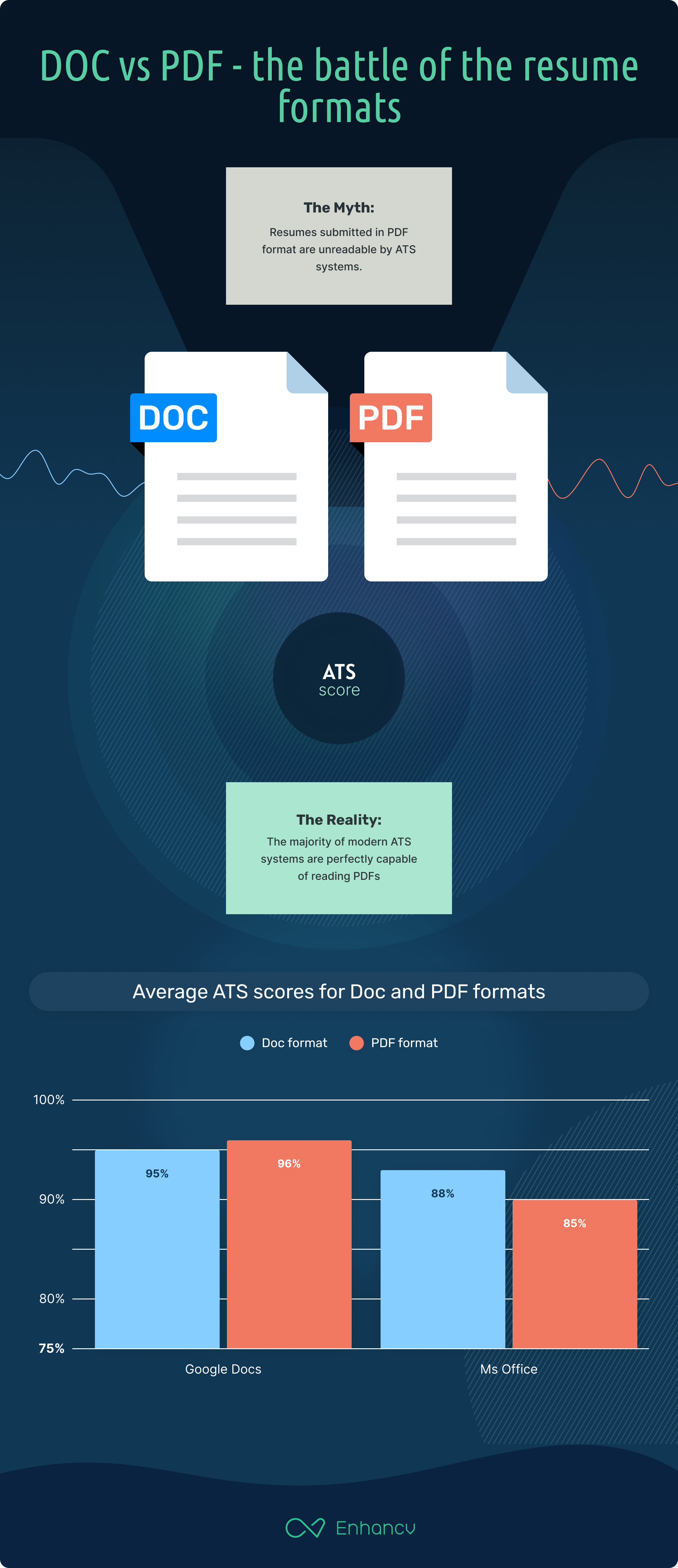
The Myth: Another common belief is that resumes submitted in PDF format are unreadable by ATS systems, causing them to be automatically rejected.
The Reality: The majority of modern ATS systems are perfectly capable of reading PDFs.
For this part of the research we included (and subsequently pitted against each other) only two resume-building solutions from the tested list - Google Docs and Microsoft Office, and the reason for that is fairly simple - only those two offer a native export option in Doc format.
For resumes created with Google Docs, the ATS seems to really love them. Whether in Doc or PDF format, they both scored incredibly well, almost neck and neck, with average parsing scores of 95% and 96%, respectively. It captures essential information really well. For instance, names, phone numbers, LinkedIn details, and experience descriptions are spot-on with 100% accuracy. But, a slight hiccup is spotted in parsing the location in the Doc format which stands at 50% and slightly better at 60% for the PDF format.
Switching gears to MS Office, it's a bit of a different story. The Doc format, native to Microsoft Office, with an average ATS score of 88% performed better than the PDF at 85%. The ATS does a flawless job recognizing location, with both formats at 70%, and experiences related to bullets, company positions, and descriptions are parsed excellently at around 90-100%. Yet, there are some nuances. Skills, for example, are a bit of a weak point, being parsed at only 55%. LinkedIn details also show a drop in the PDF format to 75%.
However, what is most important, it's always best to read the specific job application instructions to see if a certain file type is preferred or required. If no guidelines are given, a PDF is generally a safe bet, especially when using Google Docs.
Myth 3: Infographics Don't Work with Your Resume
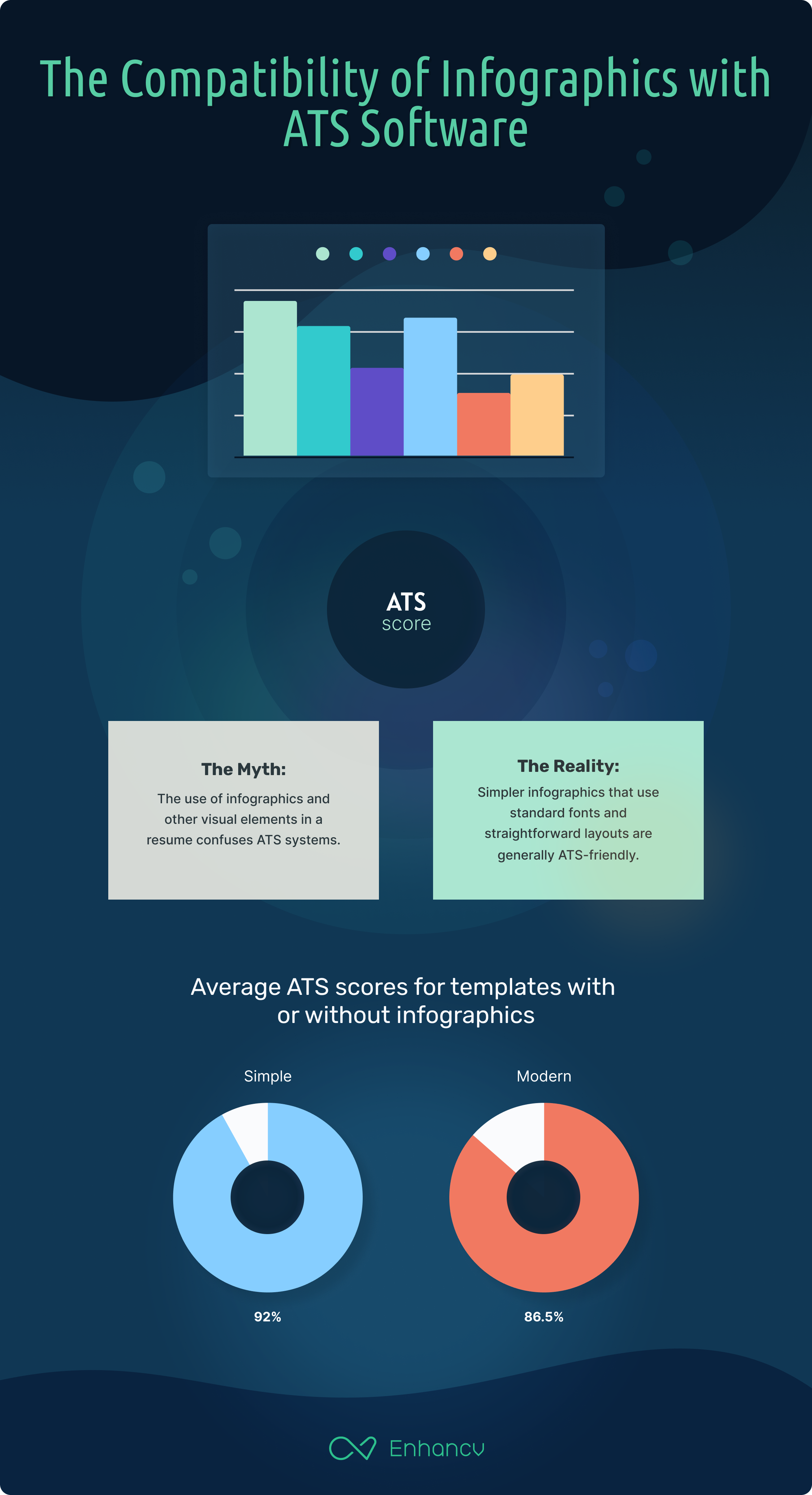
The Myth: The use of infographics and other visual elements in a resume is often said to confuse ATS systems, causing these resumes to be thrown out.
The Reality: It's true that overly complicated or elaborate infographic resumes may pose challenges for older or less sophisticated ATS systems. However, according to our research, simpler infographics that use standard fonts and straightforward layouts are generally ATS-friendly.
For this part of the research we analyzed the parse rate of resume templates with infographics and the ones without, and how it affected the overall parse rate of the whole resume and the specific data contained in the infographics.
Starting with Canva - if you're looking to use infographics, be cautious. The Modern resumes containing infographics scored an average ATS rate of 73%. That's a notable drop from the Simple resumes without infographics which stood at 85%.
One major hiccup?
Skills weren't recognized at all in either type.
On the brighter side, areas like names, phones, and certifications were pretty consistently parsed. But, if you’re after ATS-friendliness, maybe go with the simpler design here.
Our own Enhancv scored really high in the matter. Regardless of whether you opt for a modern design with infographics or a plain one, the ATS parsing scores are through the roof.
The Modern design even outshines the Simple by a smidge, boasting a whopping 98% average score compared to 95%. Almost all areas, from names to certifications, stood strong at 100% or close.
Let's talk Google Docs. With an ATS score of 95%, it’s almost at par with Enhancv's designs. The only slight glitch? Location, parsed at 55%. Otherwise, it’s all a green signal.
Last but not least, MS Office. The Modern design yields a respectable 84%, while the Simple version pushes that up to 91%. Both formats showcase robust parsing for names and phone numbers. The modern version lags a bit in areas like LinkedIn and skills but stands strong in experiences, especially bullets and descriptions.
All in all? If you're a fan of infographics and visuals, we’re not humble enough to state that Enhancv is the golden ticket. But if you're looking for simplicity and reliability, you can't go wrong with either Google Docs or the Simple version of MS Office. Canva is a great platform, but perhaps best suited for roles or industries where ATS isn't a primary concern.
The trick is to keep it simple and avoid using images to convey important information. If you decide to use infographics or other visual elements, make sure the crucial details are also listed in text form.
When it comes to the nitty-gritty of ATS parsing, colors and fonts generally don't tip the scales.
That's right!
The systems primarily focus on text content, structure, and relevant keywords. So, whether you've opted for a vibrant shade of teal or a muted gray, or decided between a classic 'Times New Roman' and a chic 'Helvetica', it won't make a jot of difference to the ATS.
However, that's not to downplay their importance.
The choice of colors and fonts can significantly influence the overall aesthetics, readability, and vibe of the resume. They play a crucial role in making that first impression and ensuring that the document is appealing and legible when eventually viewed by human eyes. In industries where creativity and design sensibilities matter, these elements can even become central to standing out.
So while you shouldn't fret about colors and fonts from an ATS standpoint, they remain pivotal for showcasing professionalism, attention to detail, and personal branding.
Always remember, once the ATS has done its part, your resume should still shine in front of human recruiters!
Takeaways
Key takeaways from our research include:
- Modern ATS systems are more adaptable than the myths suggest. They can handle double-column resumes and readily process PDF formats.
- When using resume-building software designed with ATS in mind, like Enhancv and Google Docs, the distinction between single-column and double-column layouts becomes less significant.
- Simplicity is key. Whether you're using infographics or other visual elements, ensure crucial details are present in text form. Avoid overly complicated designs that might trip up older ATS systems.
- While ATS doesn't discriminate based on colors or fonts, the design aesthetics remain paramount for human reviewers. Balancing ATS-friendliness with a visually appealing resume is the ideal strategy.
- Lastly, don't just rely on tricks to 'game' the system. A genuine resume reflecting your skills and experience is always the best approach for long-term career success.
- Understanding and demystifying the workings of ATS can empower job seekers to navigate the job application process more confidently. Always remember that while technology plays a significant role, at the end of the day, it's the human connection, skills, and experience that seal the deal.
The methodology used in the research
In this research study, we sought to assess the compatibility of various resume templates with the Applicant Tracking System (ATS) used by Indeed, a leading job search platform.
We selected a wide range of resume templates from different sources such as:
- Google Docs (5 recommended templates for Resumes, DOC and PDF format)
- Enhancv (Double Column, Single Column, Modern, Compact, Timeline, Creative, Stylish, Polished, Elegant, Ivy League, Classic, Minimal, all in PDF format)
- Canva (Beige Simple Content Editor Professional Resumes Templates, Black Blue Modern Professional CV Resume Template, Black White Minimalist Architect Resume, Brown Creative Personal Assistant Resume On Resume Template, Simple Professional Resume Template, Black And White Corporate Resume, Black and White Minimalist Professional Resume, Black and White Minimalistic Simple Resume, White Blue Modern Clean Professional Marketing ATS Resume, White Gold Elegant Minimalist ATS Data Analyst Resume CV A4 Printable, all in PDF format)
- Microsoft Office (Columns, Attorney, Crisp and Clean, Minimalist, Headshot, Cubist, Manager in Regulatory Affairs, Modern Initials, Paralegal, Bold Modern, DOC and PDF format)
These templates were further classified based on their layout design (number of columns), style (Simple vs. Modern), and file type (PDF or Doc).
Each resume was then populated with standardized data to ensure consistency during the ATS analysis.
The templates were uploaded to Indeed's ATS and subsequently scored on multiple dimensions, such as Name, Phone Number, Location, LinkedIn and Social Links, Summary/Objective, Skills, Education, and various components of the Experience section.
These dimensions were assessed for completeness and accuracy by the ATS and represented as a percentage score for each category. Additionally, the ATS gave each resume an overall compatibility score.
The results were compiled into a comprehensive table that not only demonstrated how each template fared in individual categories but also provided an overarching view of which templates were most compatible with the ATS used by Indeed. This multi-faceted methodology enabled us to offer a rigorous, data-driven comparison of resume templates, assisting job seekers in making informed choices.
Make one that's truly you.
