Gone are the days when a resume was only about showing your work experience.
A great creative resume needs to stand out.
Whether it’s at a career fair or in an HR department, when recruiters have looked at 100s of resumes in a single day, they should remember yours.
But that’s easier said than done.
So we found 23 truly unique creative resume examples to show you just what’s possible.
While each has its strengths and weaknesses, they all have something to teach you about how to create a standout resume.
Here’s what you’ll learn today:
- Browse through unique resume examples and the tactics they use to highlight important info;
- When should you be creative on your resume (and when not);
- Practical tips on how to make your resume more visually appealing.
Is your resume good enough?
Drop your resume here or choose a file. PDF & DOCX only. Max 2MB file size.
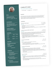
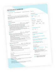
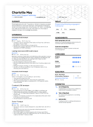
We designed most of Enhancv’s features with the applicant’s individuality in mind.
Sure, we could have made a sleuth of simpler, black-on-white resume designs, but for that you’ve already got MS Office.
Some features that make Enhancv a staple creative resume builder include My Time, the 1000s of font, colour and background combos and the ability to rename just about any section of the builder to your liking.
This gives you a starting point to unleash your creativity and do some wondrous things without going overboard:
- Spruce up your headline or any other section;
- Make use of a single page resume;
- Describe your passions and professional resume story just like we did with Marissa Mayer’s resume.
For the 23 designers below, sending a resume in a black-on-white A4 doc file is a sacrilege.
And, while being creative on your resume has its time and place (read more about that at the end of the article), you can use some of the design choices below to your advantage.
Let’s dive in!
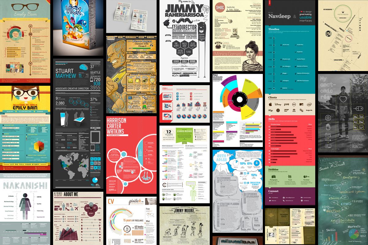
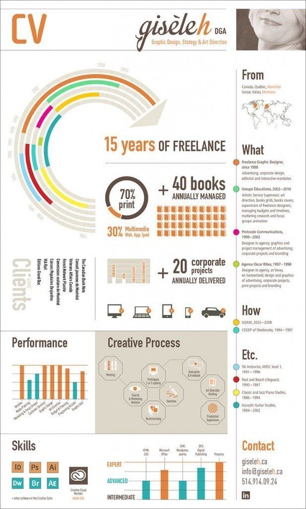
Gisele Henne creative resume shows results not responsibilities
Gisele’s resume does a great job balancing eye-catching design with a strong focus on results. Right away you can’t miss the key metrics here: 20 corporate projects delivered, 40 books managed, 15 years of freelance experience. All that is valuable information you have to pass to the reader right away.
It’s best to focus on results and not responsibilities. This has been a resume writing best practice for years, but it can’t be emphasized enough. Still, what makes this resume stand out is the “creative process” section. It’s designed to get the reader to really understand Gisele’s way of thinking, something a traditional resume wouldn’t be able to convey.
Last but not least, the “Etc.” section is a very smart way to grab employers’ attention and showcase side activities that shaped Gisele as the person. Things like playing the piano and guitar since childhood may be left out of most resumes, but they show qualities like dedication and consistency.
Gisele didn’t play for a few years and then got bored, she stuck with it. Those are qualities employers look for.
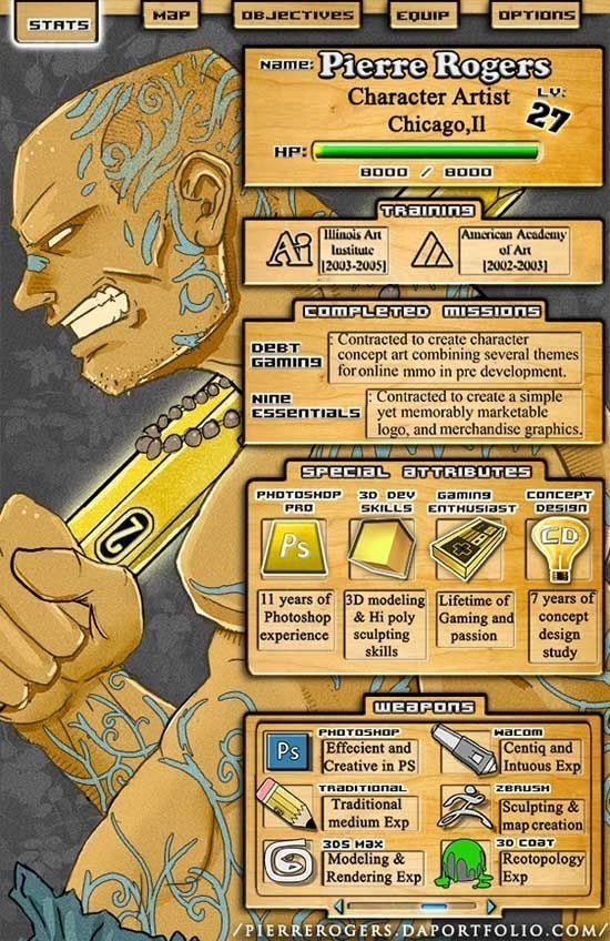
Pierre Rogers’ creative resume showcases intense passion
Pierre Rogers has incorporated his passion for computer games into his resume. His completed missions are his achievements, his special attributes are his experience and his weapons are his software as a character artist. It’s clear he didn’t get into his field because he couldn’t think of anything better to do.
Showing your passion for your work speaks volumes to employers, making you more memorable and hireable. That’s a lesson Pierre has learned well.
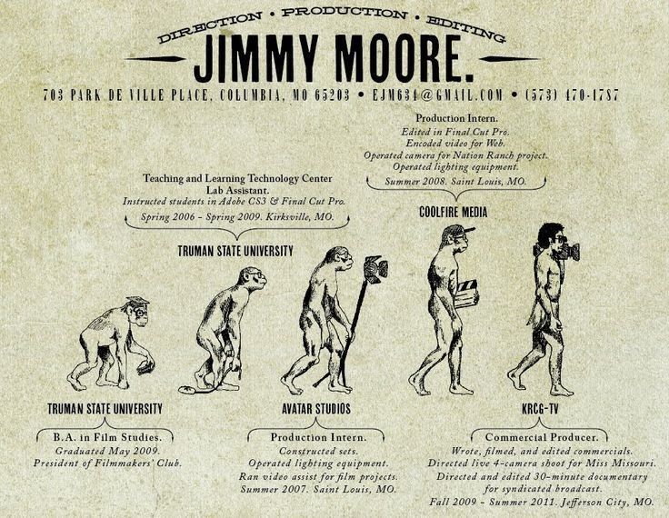
Jimmy Moore’s resume shows out of the box thinking
Filmmakers and producers always need to be ready to think outside of the box. From having to reshoot a certain scene when an actor has a new hairstyle to creating a chase sequence on a shoestring budget. Jimmy‘s resume shows he has the mindset to tackle those tough problems by showcasing his creativity. True, it has far fewer career details, but those can always be available on request. What Jimmy has done here is make a strong first impression.
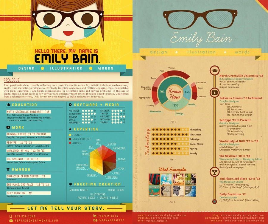
Emily Bain shows how a creative resume can stand out
With both of the resumes she uses, Emily starts off with her top professional strengths. Putting them right beneath her name ensures any read will get the main points right off the bat. One resume then focuses on telling her story and giving important context to the rest of the resume while the other gets straight into her work history.
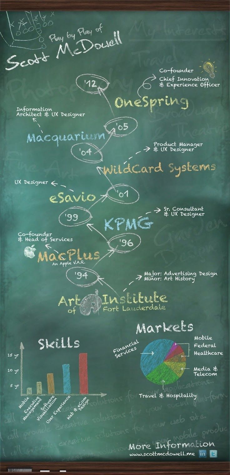
Scott McDowell's creative resume is playful and inventive
Scott’s resume gives you an immediate impression of who he is and how he thinks. What it sacrifices in details it makes up for in personality (plus by including a link to more information, the typical biographical details we expect to see on a resume are all readily available).
The inclusion of subtle background elements encourages readers to take some time to explore the resume, giving it more time to make an impression.
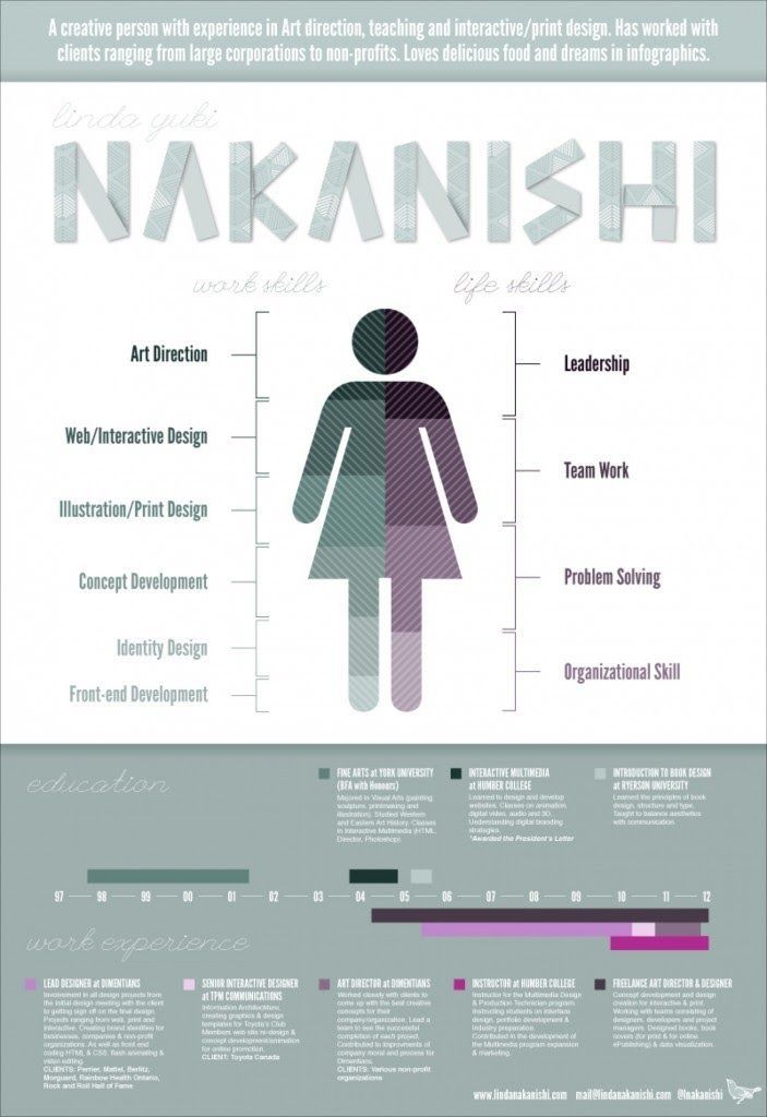
Linda Nakanishi shows by doing
You may have read that recruiters spend 6 seconds on a resume. Well, it’s unfortunately true. Often the choice whoever gets an interview call comes down to who made a quick impression. Linda starts off with two sentences explaining who she is and what she does before breaking down her work and life skills.
The result is a resume that explains the essentials in advance before inviting you to explore more. You can check Linda’s website here.
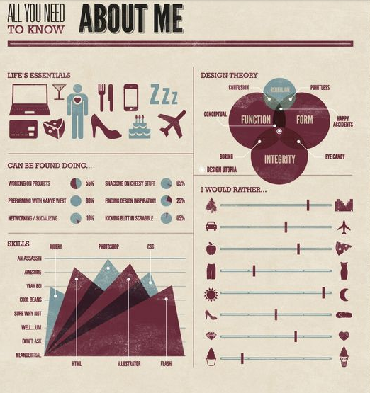
Deda's resume shows who she is as a person
You have to see the full version of Deda’s remarkable resume! In it she shares not only the obligatory things (skills, experience, etc.) but also her Design Theory, Life Essentials, Personal Lifestyle Preferences and the Statement of Purpose – things that reveal much more about her personality.
Personality is important enough that even Richard Branson admits that it’s the most important component when hiring. Why? Because tech skills can be learned with time, but being persistent, diligent, and communicative are rare gems in a sea of qualified applicants.
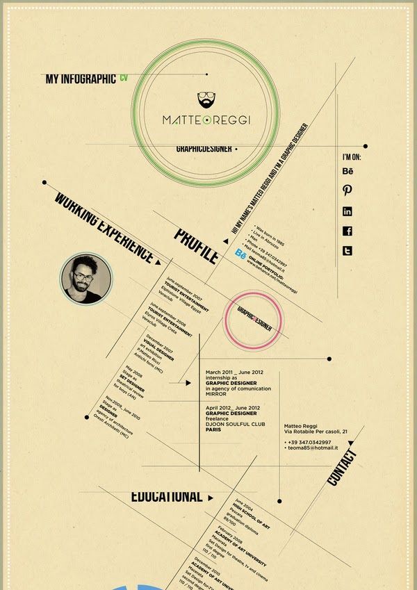
Matteo Reggi's creative resume showcases style
Matteo Reggi’s resume shows he has the mind of a designer. His mind works a bit differently and you may have to tilt your head a bit to get it all. But that’s how interesting and engaging design often works.
The resume may be unconventional, but so is Matteo. Instead of pretending to be something he’s not, he brings his whole self to his resume. If you ask us, it really shows. You can view his work here.
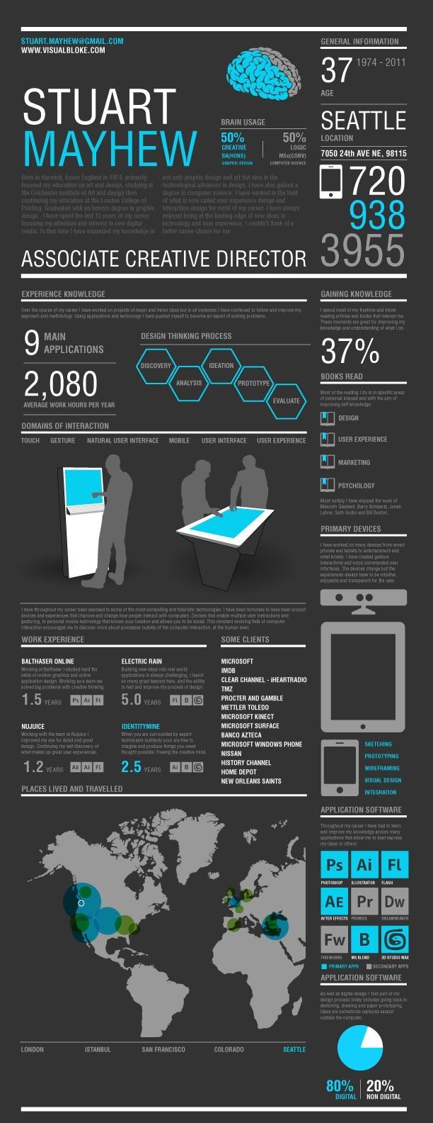
Stuart Mayhew's resume is a conversation starter
We simply love this resume! Stuart Mayhew has combined information regarding his knowledge and experience and has shaped it brilliantly with this design. It paints a picture of a full person, from various life and work experiences to generally how he thinks.
Combined with a powerhouse list of clients, there’s plenty here to make a recruiter want to strike up a conversation and learn more about Stuart. That’s where he can have the chance to make yet another good impression.
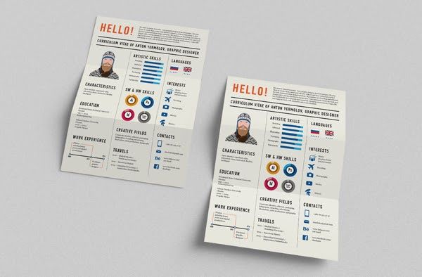
Anton Yermolov has a simple and creative 1-page resume
He’s produced hundreds of copies of his simple and contemporary 1 page resume to hand out. Besides the design, Anton’s resume stands out by including information that’s hardly typical. Travels, interests, and characteristics bring his personality and experience to the forefront.
A great idea is to change the name of your “tech skills” section to a more job-specific one like Creative Fields or Management Skills, so that it’s more relevant to the position you are applying for. Go & see his work!
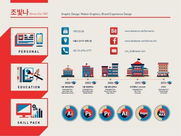
An extraordinary Korean style resume
Undoubtedly a unique design incorporating Korean elements, this resume actually stands out in more ways than one. The whole resume has a fantastic “My Favorite Things” section which really shows off their design skills. One small issue is using language like “Please contact me…” which can signal a lack of confidence. Otherwise, this resume is memorable.
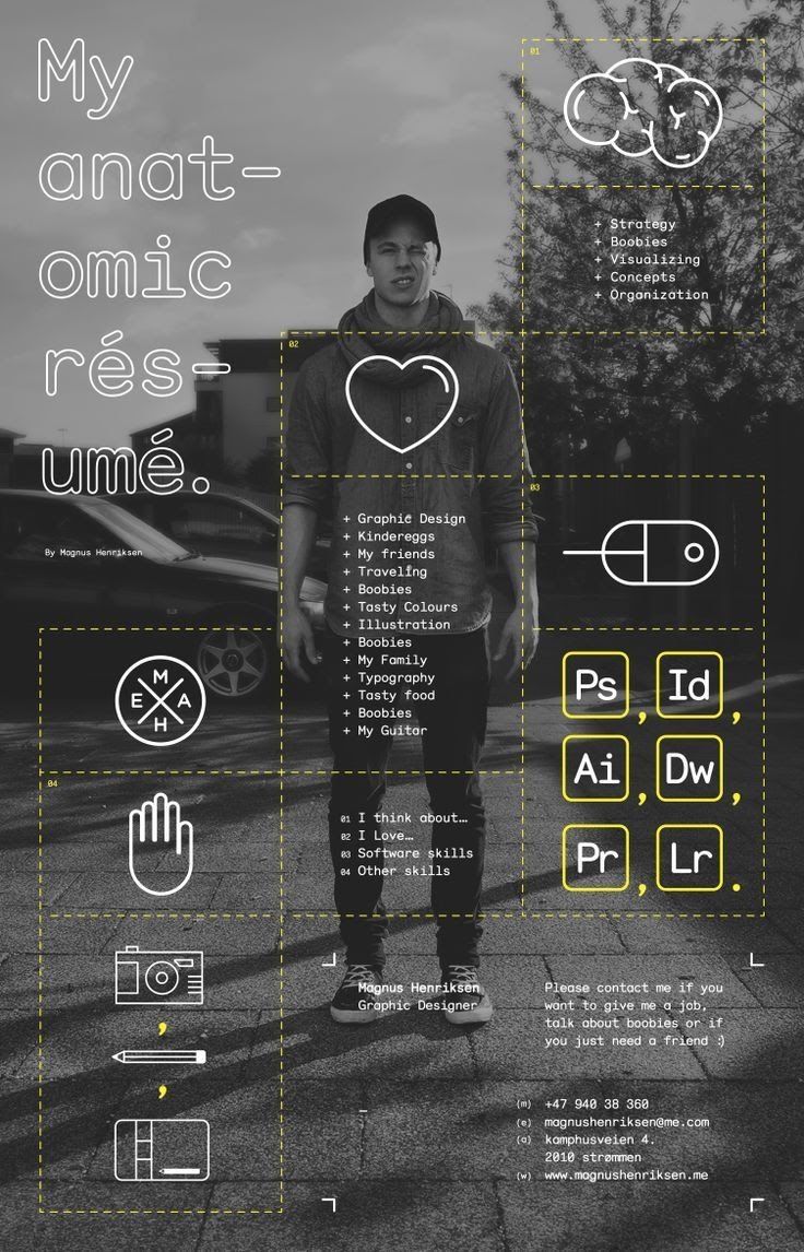
Magnus Henriksen is nothing but himself
Magnus Henriksen created this original resume that shows him both as a person and as a professional. It’s simple and straight-forward in a refreshing way while not sacrificing any personality or style. Having such a resume confirms your skills as a designer and makes you stand out. Elements of it may be a bit immature, but Magnus isn’t interested in being anything other than himself.
It’s for the best, as companies should always know what they’re getting when they hire. With Magnus, they’re getting a talented jokester. You can check out some of his work here.
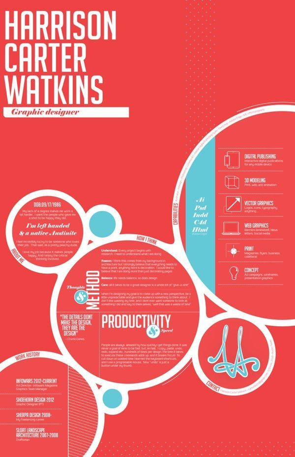
Harrison Carter watkins shows off his design philosophy
Next up is Harrison Carter Watkins’ Creative Resume. “How I think” is a powerful section to include, especially the way he did it – separate it into two parts – “Thoughts & Method” and “Productivity & Speed” which add a layer of personality alongside the technical one.
Another thing that makes a great impression is the quote featured prominently in the center: “The details don’t make the design, they are the design.”
You get a strong feeling for Harrison’s philosophy of design alongside his work experience and other details. For more of his works check out his Behance profile.
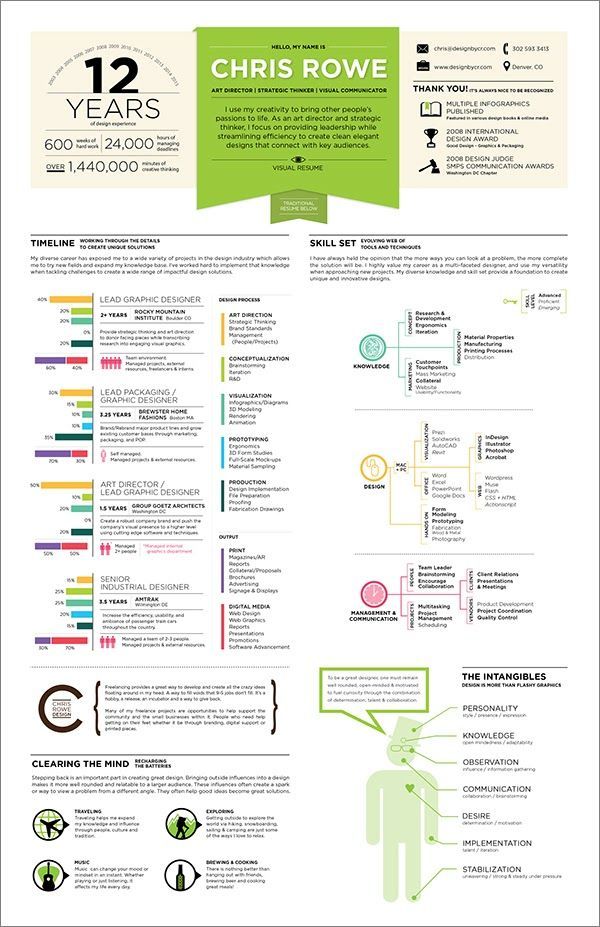
Chris Rowe's personality doesn't get lost in the details
This resume is outstanding not only because of it’s visual appearance but because of the compelling manner Chris has described himself. Including sections like “Clearing the mind” or “The Intangibles” provide a lot of details about your true personality and are a much better way to express what kind of person you are.
Besides, dividing your skill set into 3 parts – Knowledge, Design and Management & Communication, enables the recruiter to immediately see what your main areas of expertise are and gives him an incentive to keep on reading. See all his amazing work here.
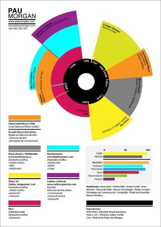
Pau Morgan gets the important information across
Here Pau has visualized his work experience in an easy-to-understand way so that a recruiter can process the information faster. He’s also included the section “Expositions” which, in his case, is pretty important and tells a lot about his abilities. Visit his personal website to enjoy more of his work.
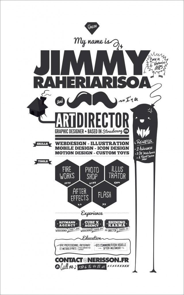
Jimmy Raheriarisoa’s resume is bursting with personality
3 things about Jimmy’s resume impressed us – it’s short and concise, extremely well-designed and it emphasizes on the most important information – his title, skills and awards. Plus, it’s bursting with personality. See all of his work here.
Monica Gomes' resume pays tribute to classics
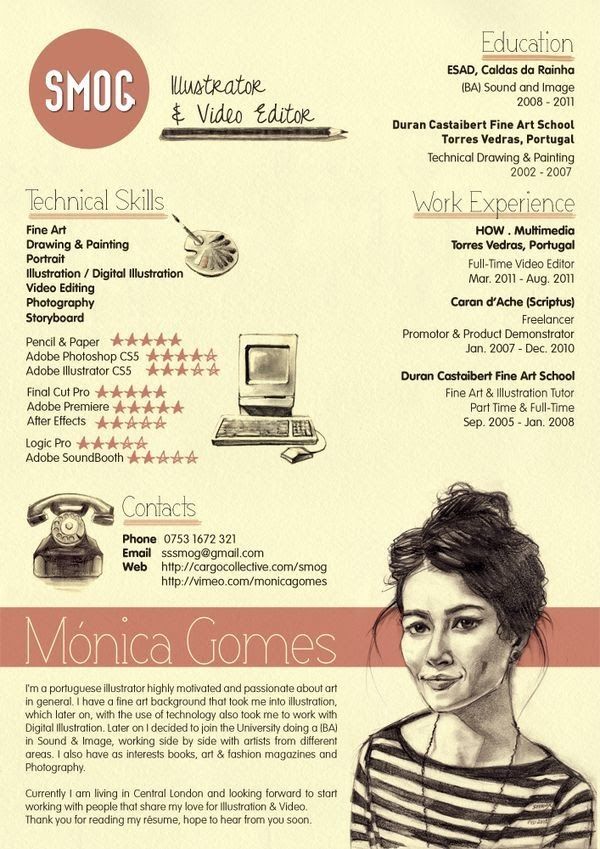
Maybe one of the most stylish resumes we’ve came upon. From its homages to the original macintosh and classic telephones to the classy self portrait, Monica shows her skills and passions with style. Combining her motivation and professional goals into the footer also leaves the reader with an excellent final impression. See her amazing work here.
Navdeep Raj's resume divides and conquers
Navdeep has done an amazing job visually breaking up the different sections in his creative resume. He begins with a simple, straight-forward line about who he is: “I love to design great looking, usable interfaces.”
The other thing we appreciated is that he highlights the fact that he has worked with top companies using a simple “Clients” section. We strongly encourage you to include that information, especially if you have worked for companies like Apple, Disney, MTV or SAP.
Last but not least the way Navdeep divided his skills so that they can be easier to process is very effective – “Practice Areas” and “Technologies”. You can check his work here.
Pam Bailey's resume tells a story
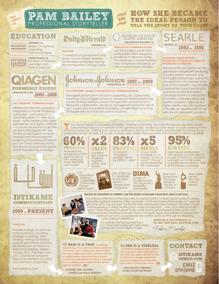
Pam is a professional storyteller whose resume does just what it should: tells her story.
Positioning her awards and professional achievements in the middle of her resume is a great idea, especially if you have some numbers and medals to show as she does. They tell the reader that you’re goal-oriented.
The other unique element here is the “Testimonials” section at the bottom.
Seth Adler's resume is tailor made for the job he wants
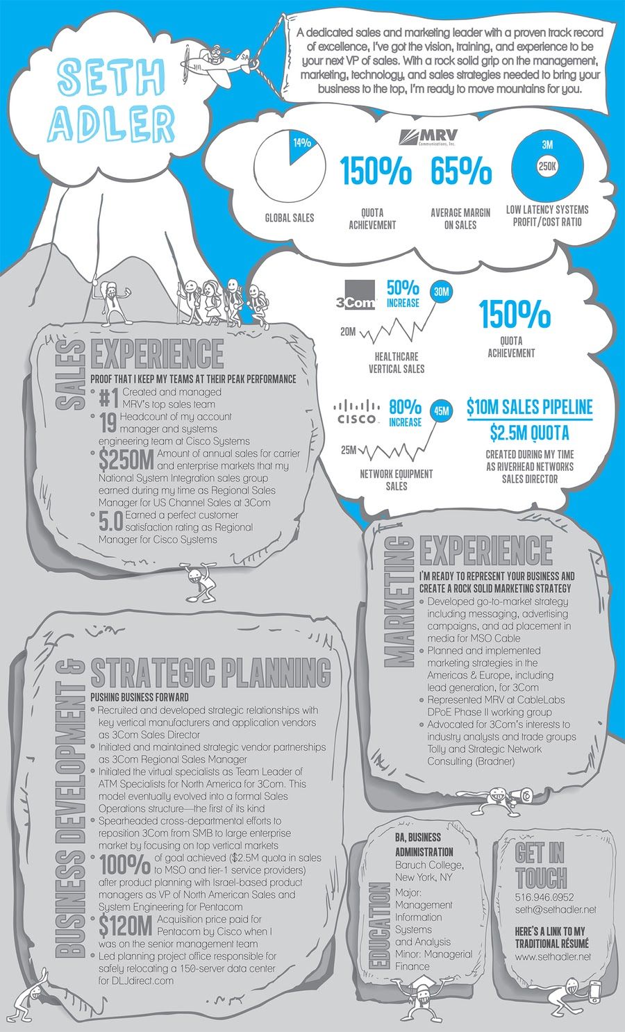
This is a great example of a performance-based resume by the same person who created Pam Bailey’s resume: Hagan Blount.
Again the content is based on results, not responsibilities, and the design highlights them well. The best part is that the resume is personalized for the VP of Sales position Seth is applying for. For that reason, he’s split his experience into three different categories – Business Development & Strategic Planning, Sales, and Marketing.
That way he stresses the fact that he has what it takes to succeed in that role. Personalizing your resume is one of the best things you could do to raise your chances of getting an interview.
Jonathan Fischer's resume is like nothing you've ever seen
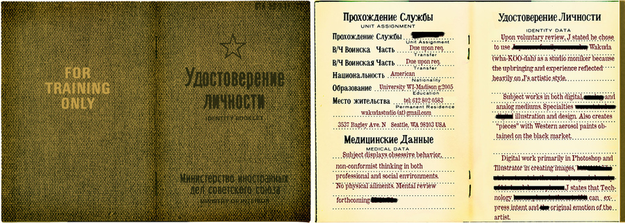
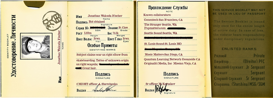
Sometimes a resume just breaks the mold. Jonathan Wakuda Fischer’s is one such example. His resume takes the form of an identity booklet, old Russian style.
Everyone likes seeing absolutely unexpected things and if you read his resume carefully you will realise that Jonathan has gone far beyond the design of his resume and has created a real masterpiece.
Recruiters aren’t going to forget him. Check out his portfolio here.
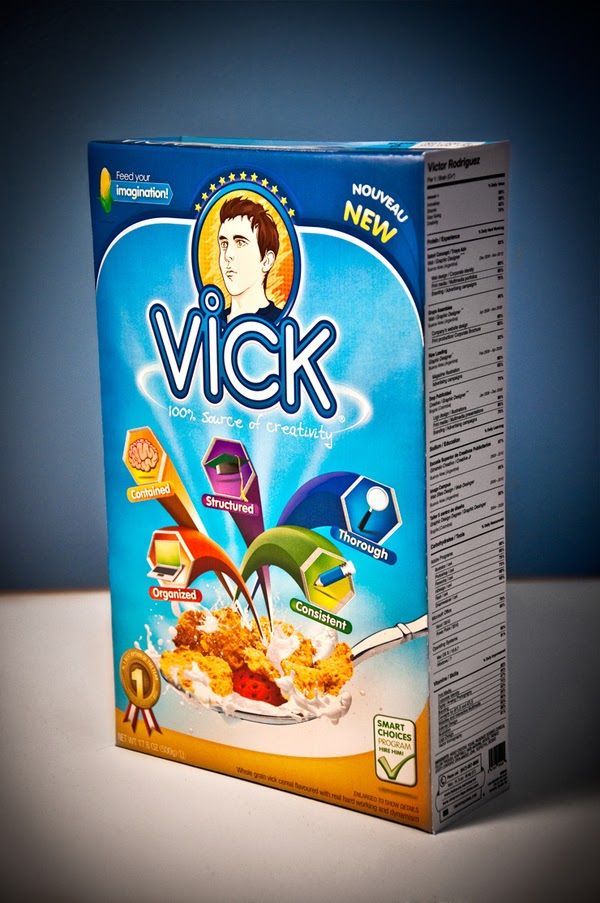
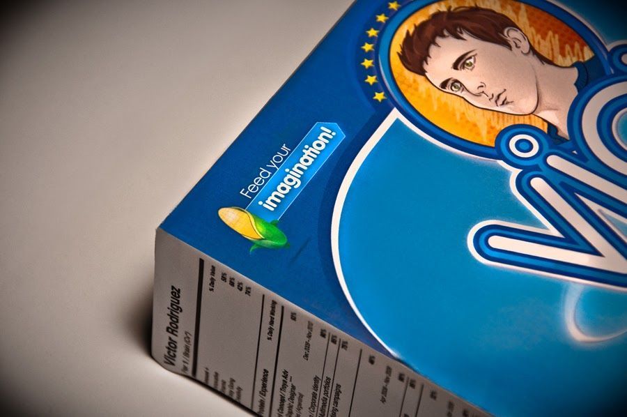
Victor Rodriguez creative resume thinks inside the box
Victor Rodriguez is clearly being a bit cheeky with his “thinking inside the box” resume. You should never forget that the main goal of your resume is to make a great first impression to the person reading it, no matter whether it’s a word document, infographic, powerpoint presentation or a cereal box.
I can barely think of a better way to grab someone’s attention, especially if this pops up on your table! You can explore Viktor’s creative work here.
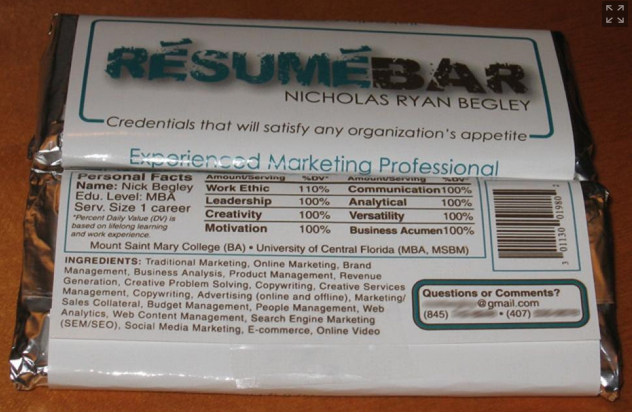
Nick Begley thinks way outside the box
We have saved the dessert for last – Nick Begley is the bold man whose resume is a candy bar. When we said these were creative resume ideas, we weren’t kidding.
Should you use a creative resume?
If you are in a creative industry you already know better as to whether or not sending a creative resume is the right way to go.
How about the rest of us, the non-designers who still want to stand out?
We have to take into consideration the public enemy #1 of creative resumes out there – the Applicant Tracking System, or ATS, for short.
It’s a computer software that is designed to read simple text on resumes and match skills, experiences and keywords to the job description.
This is why it will have a hard time if you encode your key information into graphics and images.
With that being said, the above designers don’t have to pay attention to ATS at all.
They send resumes directly to employers. Which can be the case for many of us.
Small and medium-sized companies aren’t likely to use ATS, either.
Whereas even if you’re applying for a position in a big corporation, you can still incorporate a dash of creativity, as long as you maintain a professional tone.
How do i make my resume creative (without going overboard)?
Here’s a thought – you don’t have to make a cereal box resume to impress recruiters.
Frankly speaking, nobody is expecting you to be creative.
So, if you make a few adjustments here and there, it will come as an added bonus.
Use creative tactics, such as two-colour combinations, adjusted font size, easy-to-read font family, proper resume margin and skimmable layout. (Enhancv’s resume builder takes care for the lot of it.)
Designers made their infographic resumes to highlight key information in a creative manner. You too can incorporate their tactics described above, albeit in a more down-to-earth way.
Make one that's truly you.
