A resume layout isn’t just about where things sit on a page—it’s a strategy that determines if your story gets read.
Templates are a great starting point. They give you a professional structure, save you time, and ensure your resume looks polished. But even the best template needs intentional customization to truly work for your career story. That’s where layout strategy comes in.
The layout you choose—and how you arrange and prioritize your information—can guide the reader’s eye, highlight your strengths, and make you memorable in seconds.
At Enhancv, we see templates and layout strategy as partners:
- Templates give you the framework.
- Layout strategy helps you tell your story within that framework.
Let’s take that solid foundation that your template gives you and build on it—shaping a layout that tells your story with clarity, focus, and impact.

Key takeaways
- A strong resume layout combines a solid template with an intentional design strategy.
- The F-shape scan draws recruiters’ focus to the top and left areas of your resume first.
- Tailor section order—skills, experience, or achievements—based on your career stage and goals.
- Use whitespace, consistent formatting, and subtle color for a clean, professional look.
- Avoid layout mistakes like overcrowding, misalignment, and design elements that could be misread by applicant tracking systems (ATS).
From template to tailored layout: mindset shift
| Start with a template | Elevate with a layout strategy |
|---|---|
| Select a design that feels right for the role | Customize section order to show key strengths |
| Use the provided headings and style | Adapt headings to emphasize achievements or skills |
| Keep default spacing and structure | Adjust spacing to draw attention to important details |
| Focus on filling in all the fields | Focus on guiding the reader’s attention |
| Match the job posting visually | Match both the job posting and recruiter reading patterns |
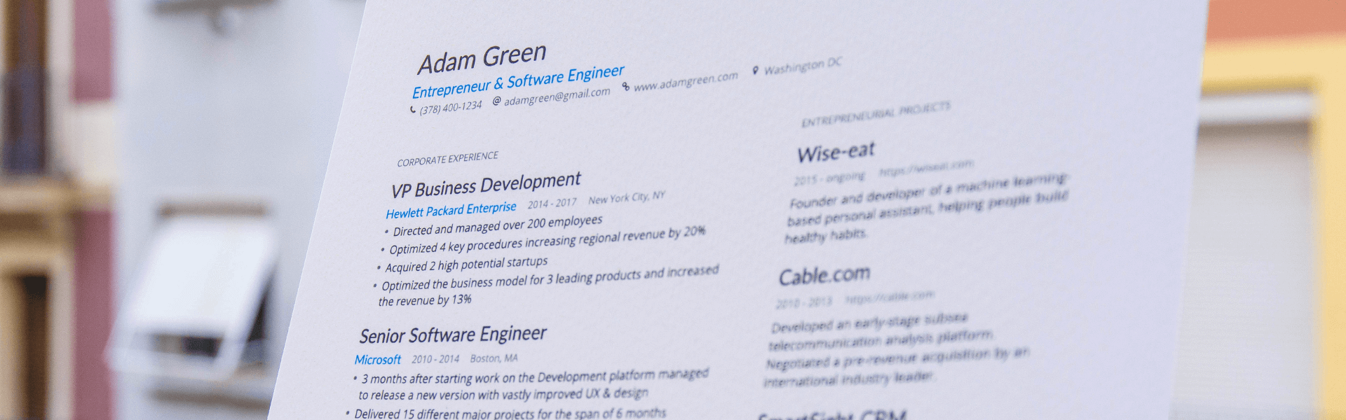
Resume layout: How recruiters actually read your resume
Let’s talk about how recruiters actually read resumes. They’re not reading line by line like a novel—they’re scanning, and your resume layout either works with that scan or against it.
The F-shape
This is one of the most common scanning patterns. Recruiters’ eyes typically move across the top of the page first (to take in your name, title, and contact information). Then scan down the left side to catch section headings, company names, and dates.
They may make shorter horizontal glances into the right-hand side to pick up key details like job titles or standout achievements.
If your layout places the most important details in these natural scan zones—top third for the essentials, left margin for section cues, and bold highlights for keywords—you’ll make it far easier for them to quickly see why you’re a strong candidate.
The 6 to 8 second decision window
This one is actually a myth—here’s why:
A widely circulated statistic claims recruiters only spend six seconds skimming resumes. While it did find that recruiters performed a rapid initial scan, this snapshot often refers to just the first impression, not the entire review process.
In reality, recruiters tend to skim quickly—but if your layout delivers clarity and relevance, they’ll spend considerably more time reviewing your resume.
What recruiters look for first
When recruiters first glance at your resume, they’re scanning for quick confirmation that you’re a strong match.
Here are the four elements that usually get their attention first:
- Your name (clear and prominent)
- Your professional title (aligned with the role you want)
- Your most recent role (to gauge relevance and career level)
- Key skills or keywords (matching the job posting)
The conclusion?
By placing your strongest content in high-visibility areas, such as the top third of the page or along the left margin, and using consistent formatting to highlight them, you increase the chances that recruiters will notice what truly sets you apart.
That’s where Enhancv’s resume templates come in. They organize information neatly, so when recruiters see your application, they’ll get the important points right away.
Professional resume layout principles
You want to be intentional about what’s included in your professional resume layout. Follow these principles to make sure your choice looks appealing, reads easily, and works for both recruiters and ATS systems.

Section hierarchy and ordering
Organize your resume so the most important and relevant information appears first.
For most professionals, that means leading with work experience, followed by skills and education. Career changers or recent graduates might prioritize skills or projects instead.
Use purposeful headings to separate sections and guide the reader through your story.
Strategic whitespace and margin use
Whitespace isn’t wasted space—it’s breathing room for your content. Adequate spacing between sections, generous margins, and line spacing around bullet points make your resume easier to scan and less overwhelming to read.
Fonts, headings, and consistent formatting
Choose a clean, professional font (like Rubik, Arial, or Calibri) in a readable size—usually 10 to 12 points for body text and slightly larger for headings.
Keep formatting consistent across the document: align dates the same way, match heading styles, and use bullet points in the same format.
Color use: subtle highlights vs. over-design
A touch of color can make headings stand out or draw attention to key elements, but overuse can distract from your content. Stick to one or two complementary colors and ensure the text remains easy to read in black-and-white printing.
Best resume layout for different career situations
A single best layout—perfect for every occasion—is a unicorn. 🦄 You need a layout uniquely suited to your goals, personality, career progression, and your targeted role.
So here’s how to make sure your layout is the best for you.
Step 1. Matching layout to your career stage and goals
Before you choose a layout, decide which parts of your background you want to emphasize. If you have a steady work history in your field, experience should lead. If you’re changing careers or just starting out, skills and projects may deserve more space at the top.
Step 2. Know when to lead with skills vs. experience vs. achievements
The order of your resume sections isn’t fixed—you can arrange them to highlight your strongest selling points. Think about what will convince a recruiter within the first few seconds, and lead with that.
- Skills first: Ideal for career changers or entry-level candidates. This approach often works best with a functional resume format, which prioritizes abilities over work history.
- Experience first: Best for mid- to senior-level professionals with a clear, relevant career progression. A reverse-chronological format is the most effective here, showcasing your career growth over time.
- Achievements first: Effective for executives or high-impact roles where measurable results are a key selling point. A hybrid (or combination) format allows you to present a results-focused section before detailing your experience.
Step 3. Layout considerations by situation
Let’s review some of the more common career scenarios and which layout is most appropriate for them.
Career changers
A combination layout works well here, blending a prominent skills section with selected, relevant experience. Pair it with a brief summary that explains your transition and connects your past work to your target role. This format helps recruiters see transferable skills upfront while still showing your professional background.
Optimize your career change resume summary for ATS
Drop your resume here or choose a file.
PDF & DOCX only. Max 2MB file size.
Entry-level professionals
With limited work history, focus on potential—showcase your education, internships, volunteer work, and relevant projects. A functional or hybrid layout allows you to give these sections prime real estate, helping fill the page while emphasizing what you can do rather than what you’ve already done.
Executives
Lead with a strong professional summary followed by a key achievements section that illustrates measurable impact. A hybrid layout is ideal, letting you present results before detailing experience, while still maintaining a clear career narrative.
Creative roles
Use a modern template to add visual interest without sacrificing readability. Incorporate design elements like subtle icons, section dividers, accent colors, or backgrounds to demonstrate aesthetic skill. Ensure the core information is easy to scan and ATS-friendly.
Technical roles
Put your skills and tools section in a high-visibility spot, such as the top or left column, so recruiters and hiring managers can quickly assess technical fit. Highlight relevant projects or technical accomplishments near the top, especially if they demonstrate mastery of in-demand tools or frameworks.
Each of these templates is editable with a single click. Try them out to create a winning resume.
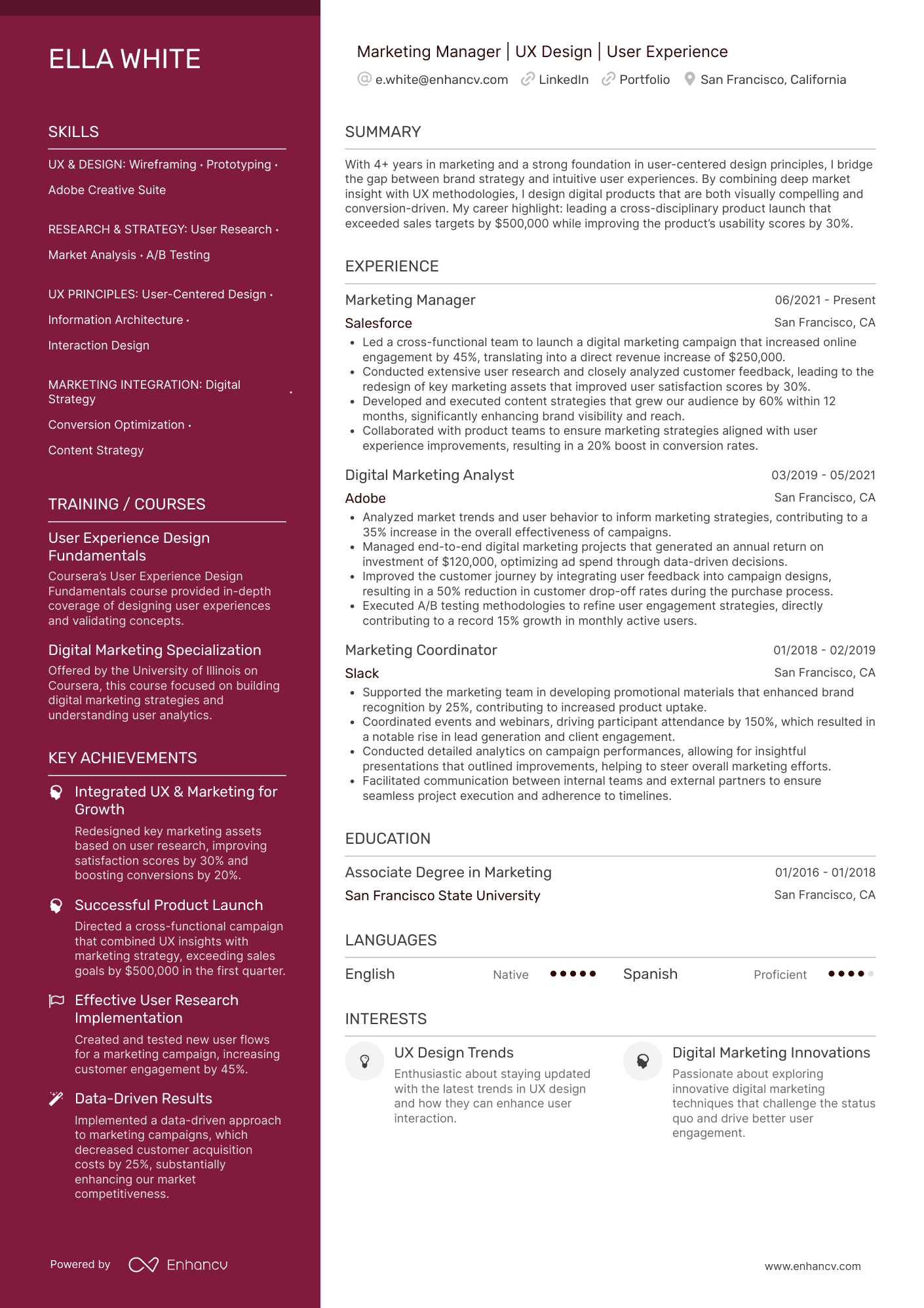
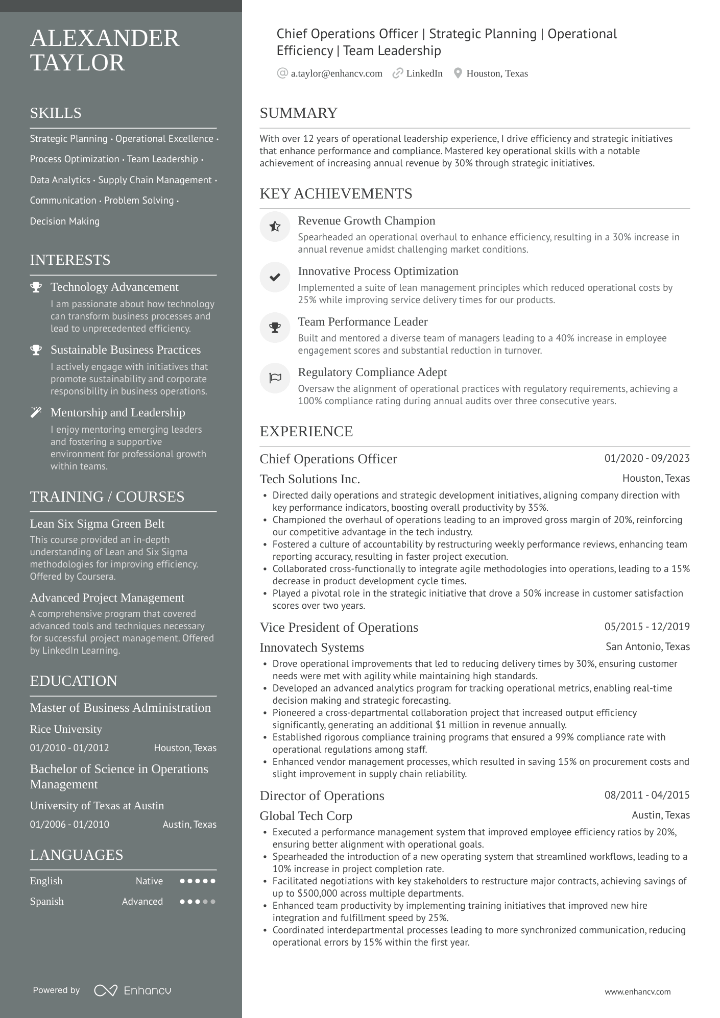
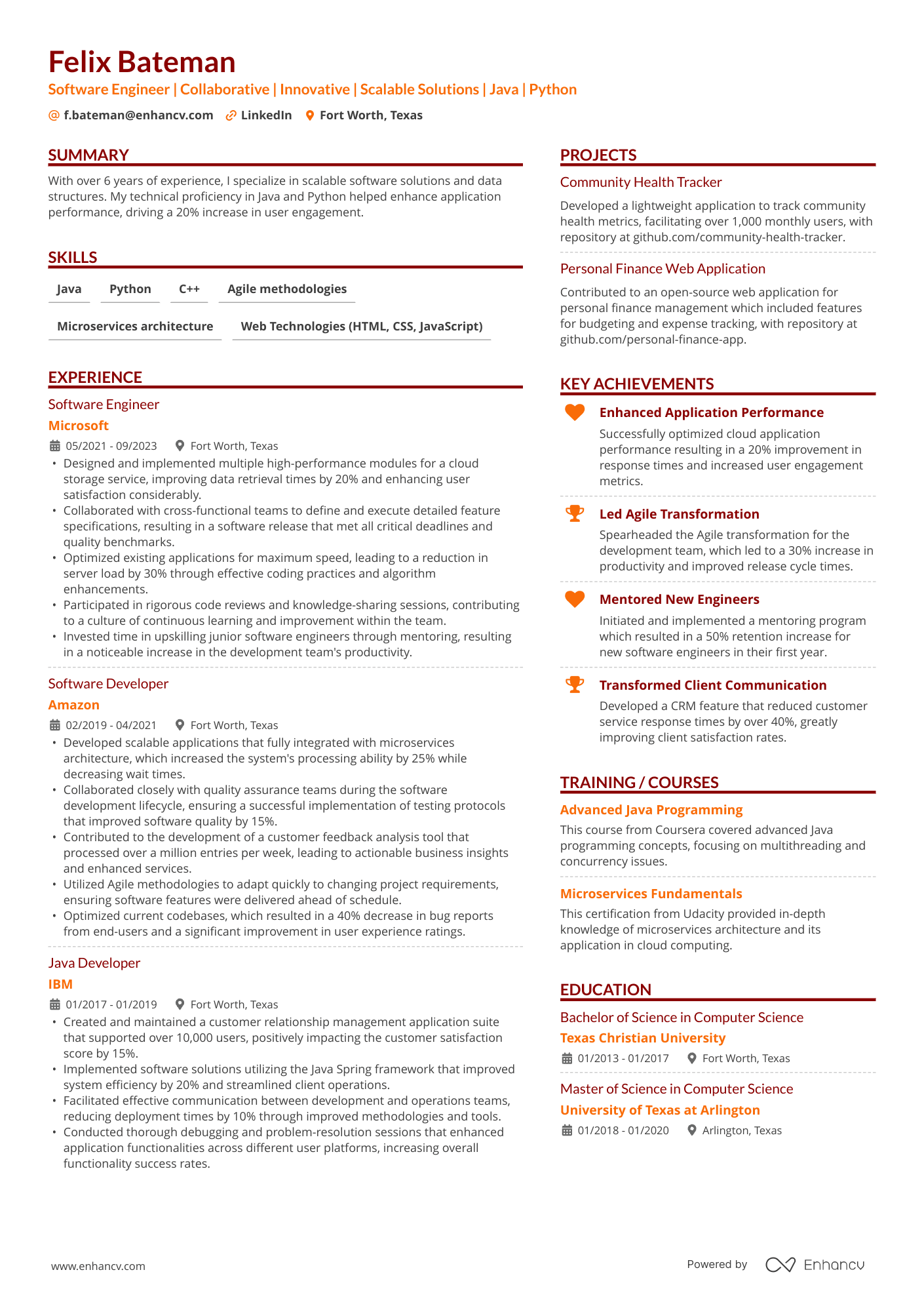
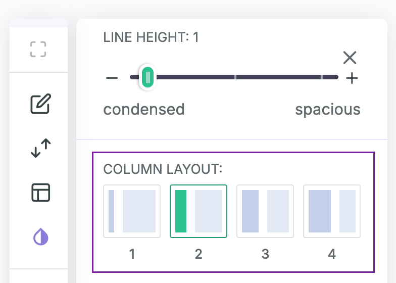
Resume layout templates: column widths that guide the reader
Not all two-column resumes are created equal. With Enhancv, you can choose different column widths to control what gets seen first. Think of columns as visual “weight.” The wider column gets the bulkier text—ideal for your experience—while the narrow column is perfect for info that draws attention right away.
You can easily access this option in the Enhancv Resume Builder. Once you’re in it, click on the “Design & Font” option on the menu to your right and scroll until you find “Column Layout.” Then, choose your preferred design.
What to place in the sidebar (narrow column)
- Contact info, links (LinkedIn, portfolio, GitHub)—unless they’re in the header
- Skills/tools (scannable lists)
- Certifications, languages, awards, interests
- Short add-ons (volunteering, publications, conferences)
What belongs in the main (wide) column
- Summary or headline
- Experience and quantified achievements
- Selected projects/case studies
- Education (if early-career)

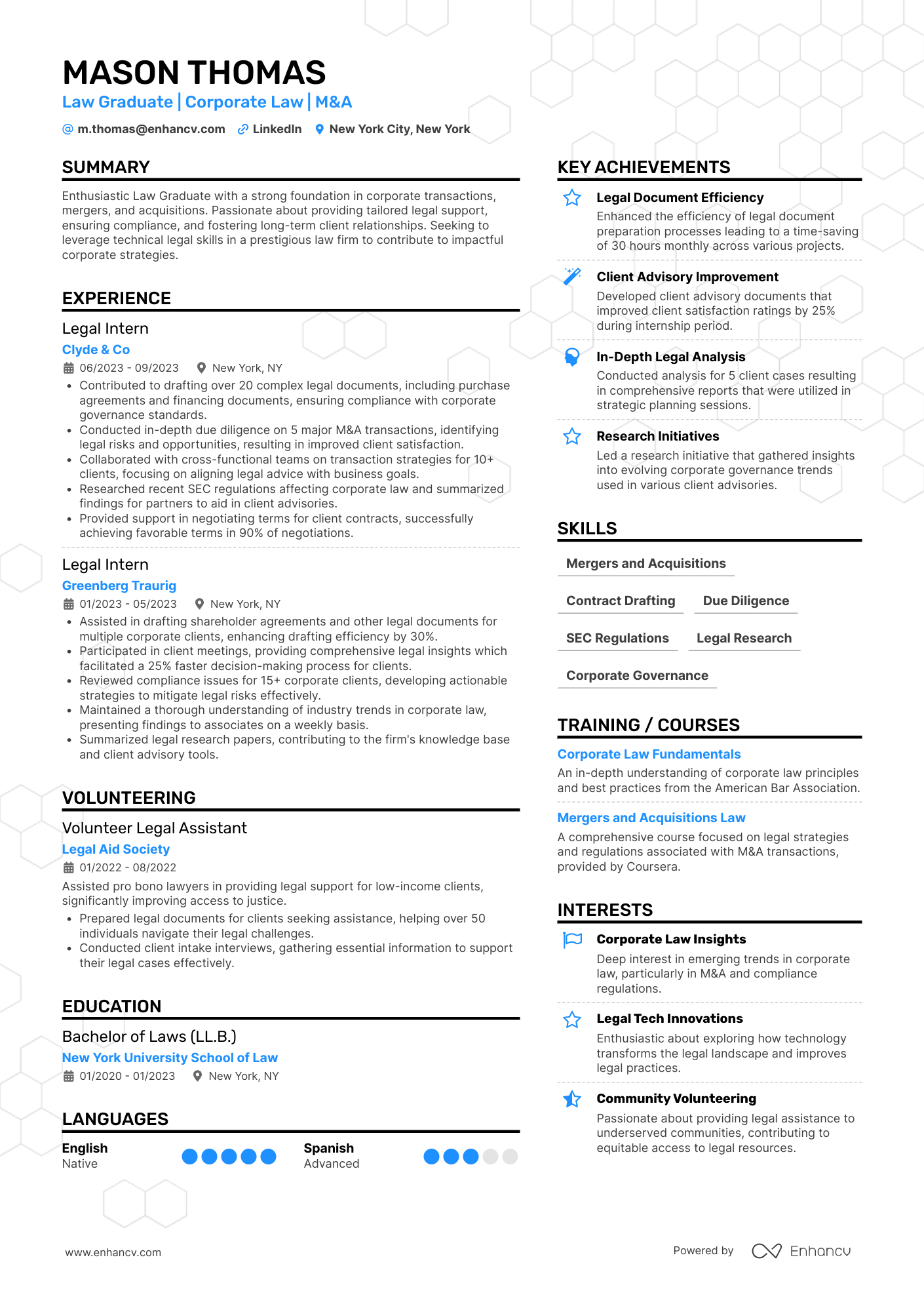
What about single and multicolumn layouts?
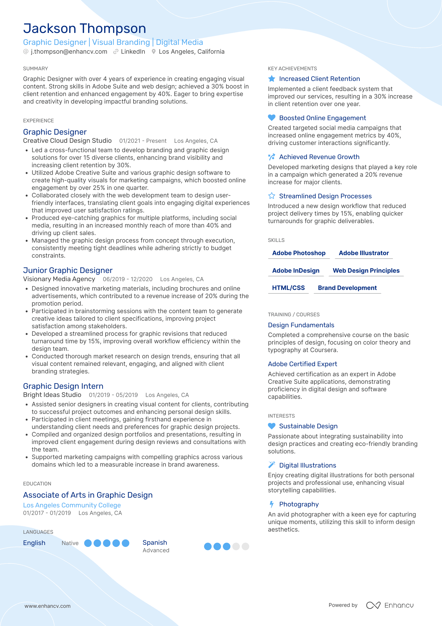
A single-column layout, like our “Ivy League” template, is the expected choice for fields like academia and government, where clarity and compatibility are paramount. Without visual columns, your resume relies on section hierarchy, clear headings, and consistent spacing to guide the reader’s eye from top to bottom.
A three-column layout—like our “Multicolumn” template—works well for executives who need to fit extensive experience and achievements onto one page. Use it for compact, high-impact elements like logos, skill matrices, or brief highlights, but avoid placing detailed work history or lengthy descriptions here.
Common resume layout mistakes to avoid
Finally, let’s discuss some of the common mistakes you don’t want to make with your layout.
Overcrowding with text
Trying to fit too much information on a single page often results in cramped margins, tiny fonts, and dense blocks of text. This overwhelms the reader and makes key points harder to find.
Instead, use whitespace strategically to give each section room to breathe and allow important details to stand out.
Inconsistent alignment or spacing
Uneven spacing between sections, misaligned bullet points, or irregular indentation can make your resume look unpolished.
Consistency signals professionalism—align dates, headings, and bullet points in a clean, uniform way across the entire document.
Poor prioritization of information
If your most relevant skills and achievements are buried in the middle or bottom of the page, recruiters may never see them. Order your sections and content so the most impactful details appear in high-visibility areas like the top third of your resume.
Conclusion: bringing your resume layout together
A great resume layout starts with a solid template but comes to life when paired with a clear strategy. Templates give you the framework, while a layout strategy turns that framework into a story that’s tailored to your career goals.
Ready to put these ideas into action? Explore Enhancv’s resume templates, test your resume with our ATS Checker, and browse our library of resume examples for even more inspiration.
Is your resume good enough?
Drop your resume here or choose a file. PDF & DOCX only. Max 2MB file size.
Make one that's truly you.