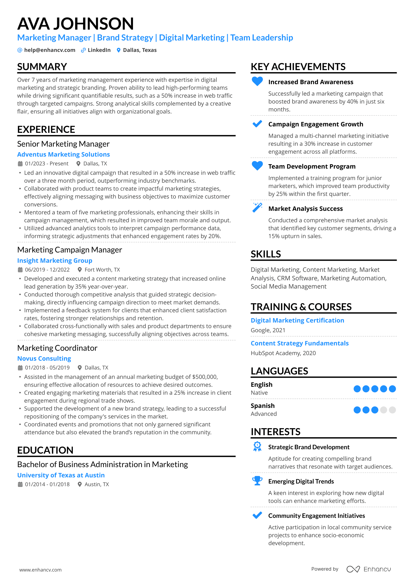
Choosing an ATS-friendly resume font sounds like a small decision, but it still causes a lot of anxiety—especially around applicant tracking system (ATS) rejection. You’ve probably seen claims that “the ATS will reject your resume if you use the wrong font” or “creative templates never get through.”
In 2025, Enhancv interviewed twenty-five recruiters across industries and found that 92% said their ATS doesn’t automatically reject resumes for formatting, content, or design. Fonts don’t usually get you rejected—but they do affect how clearly both ATS and humans can read your resume.

Key takeaways
- Use simple, professional fonts like Rubik, Lato, Raleway, Bitter, or Tinos.
- Keep your resume font size between 10–12 pt for body text and 14–16 pt for headings.
- Avoid decorative or script fonts—ATS tools struggle to parse them reliably.
- Save your resume as a PDF unless the job posting requests DOCX.
- Use one resume font throughout—mixing fonts decreases readability.
- Enhancv’s ATS-friendly resume templates use professionally selected fonts that parse reliably across major ATS tools.
Before you can choose the best fonts for an ATS-friendly resume, you need a clear definition.
What are ATS-friendly fonts?
ATS-compatible fonts are typefaces that applicant tracking systems can parse reliably and that remain highly readable for human recruiters.
They:
- Use clean, standard character shapes.
- Export correctly to PDF and DOCX.
- Don’t turn letters into images or glyphs.
- Preserve spacing and hierarchy in plain text.
Typical examples you’ll see recommended include Rubik, Arimo, Lato, Georgia, Oswald, Volkhov, and Tinos—and for good reason. They’re widely installed, stable, and predictable.
Why your font usually isn’t what gets you rejected
According to Enhancv’s recruiter interviews, ATS systems almost never auto-reject resumes for fonts or design. Only 8% of recruiters reported using content-based auto-rejection at all—and they use it for requirements and skills, not typography.

What job seekers interpret as “ATS rejection” is actually more often:
- Volume: hundreds of applicants per role
- Relevance: weak keyword match to the job
- Timing: applying late when the shortlist is already full
Your font choice won’t rescue a poorly targeted resume, but it can make a strong one easier to skim and parse quickly
What makes a good ATS-friendly resume font?
Once you know that software-friendly fonts are about clarity—not about “secret ATS hacks”—you can benchmark your current font.

A good ATS-friendly font for resume use should be:
- Readable at 10–12 pt on any screen.
- Neutral and professional, without ornate flourishes.
- Consistent across platforms, including Windows, macOS, and mobile.
- Plain-text friendly, meaning it still looks structured when pasted into a text box.
Ask yourself:
- Can I scan my own resume in under ten seconds?
- Do “I,” “l” (uppercase “i”), and “1” look distinct?
- Does the resume layout still make sense if I paste it into an online form?
- Would this look normal in a business report or presentation?
If the answer is “no” to any of these, it’s time to switch to a more ATS-friendly resume font.
Now that you know what makes a solid, ATS-friendly font, it’s time to tackle the biggest myths about how applicant tracking tools handle typography.
How ATS really handles fonts (myths vs reality)
Many job seekers still believe that:
- ATS “can’t read” certain fonts.
- ATS automatically rejects resumes with creative typography.
- Only single-column, Times New Roman resumes are safe.
Enhancv’s own testing of resume builders across multiple ATS platforms showed something different: modern designs, two-column layouts, PDFs, and non-Times fonts can all parse just fine when the underlying structure and text remain clean.
In summary:
- Fonts don’t usually cause rejection.
- Unreadable fonts and messy layouts do cause recruiters to move on quickly.
- Your goal is an ATS-compliant resume that’s also easy for humans to skim.
That’s where Enhancv’s curated font set comes in.
The ATS-friendly fonts we use at Enhancv (and what they replace)
Enhancv’s resume builder uses a curated set of ATS-friendly fonts for resume templates. These are modern, professional typefaces tested across ATS systems and devices to balance readability, aesthetics, and parsing.
Is your resume good enough?
Drop your resume here or choose a file. PDF & DOCX only. Max 2MB file size.
Below is how each font behaves, plus which classic fonts it can substitute.
Sans-serif fonts (modern and clean)
| Font type | When it works best + notes |
|---|---|
| Rubik |
|
| Arimo |
|
| Lato | |
| Raleway |
|
| Exo 2 |
|
| Chivo |
|
| Montserrat |
|
| Oswald |
|
Sans-serif fonts prioritize speed and clarity, but serif fonts offer stronger readability in dense text—useful for academic or writing-heavy roles.
Serif fonts (traditional and formal)
| Font type | When it works best + notes |
|---|---|
| Bitter |
|
| Tinos |
|
| Volkhov |
|
| Gelasio |
|
Because these fonts are built into Enhancv templates and tested in real ATS tools, you don’t need to manage font files, embedding, or substitutions.
How to choose the best ATS-friendly font from this list
If you’re using Enhancv’s builder, any of the fonts above are already safe. The question becomes: which one fits your industry and tone?
For corporate, finance, consulting, and HR
- Arimo, Lato, Tinos, Bitter
- Clean, serious, familiar to corporate recruiters
For tech, product, design, and startups
- Rubik, Lato, Montserrat, Exo 2, Chivo
- Modern, digital-native feel without sacrificing clarity
For academia, research, and writing-heavy roles
- Bitter, Tinos, Volkhov, Gelasio
- Strong serif shapes support dense text and a more classical look
For leadership and senior roles
- Lato, Chivo, Gelasio
- Balanced mix of authority and polish
Treat font choice like tone of voice: subtle, but noticeable to experienced readers.
With your font locked in, the final formatting question is simple: how big does your resume text need to be?
What font size should a resume be?
Your font size shapes both readability and ATS parsing accuracy.
Once you’ve chosen an ATS-friendly font from Enhancv’s list, focus on a font size that keeps your resume readable and consistent across screens.
Use this standardized sizing
| Sizing location | Sizing notes |
|---|---|
| Body text |
|
| Headings |
|
| Spacing |
|
Avoid body text under 10 pt and avoid using all caps in paragraphs—both make your resume harder to skim and reduce overall readability.
This sizing ensures your resume remains clean, readable, and predictable—even when parsed by older ATS systems that handle spacing inconsistently.
Best font choices by resume template type
Even ATS-friendly fonts behave differently depending on whether you use a one-column layout, a two-column design, or an ATS-optimized template.
Here’s how to match your font choice to your resume layout:
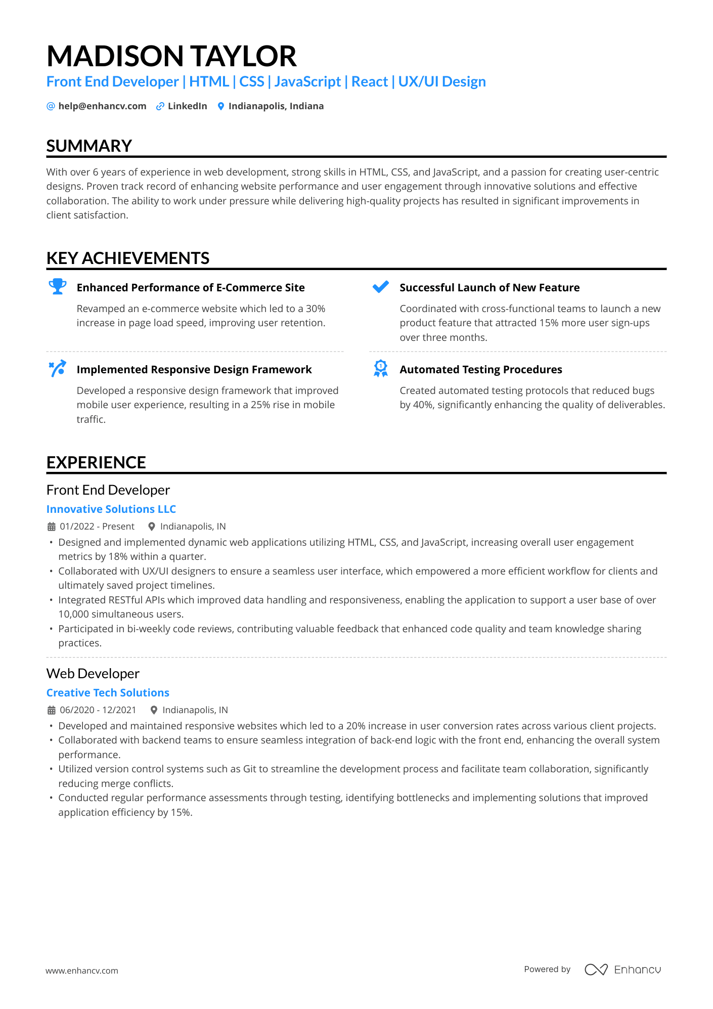
Single-column resumes
Use: Arimo, Tinos, Bitter, Rubik
These fonts maintain perfect left-to-right reading order and ensure smooth parsing in both PDF and ATS plain-text views.
Two-column resumes
Use: Lato, Montserrat, Chivo, Exo 2, Verdana (if needed), Tahoma
These fonts hold strong spacing and hierarchy inside multi-column layouts without compressing letters or causing alignment issues.
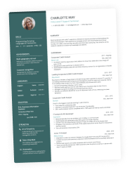
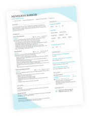
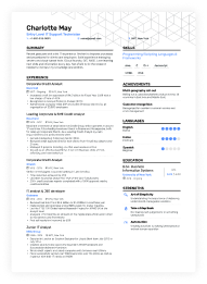
ATS-friendly resume templates
Enhancv’s professionally designed templates use Rubik, Arimo, Lato, Raleway, Bitter, Exo 2, Chivo, Tinos, Montserrat, Oswald, Volkhov, and Gelasio, all of which are tested across multiple ATS tools. This removes the guesswork and prevents spacing shifts, glyph loss, or line breaks during parsing.
Selecting the right font for your layout is only half the work—using it correctly is what makes your resume clear and skimmable. Below are some right and wrong examples to help you visualize the difference.
Right vs wrong: ATS font usage examples
Even with ATS-friendly fonts, how you use them matters. Here are simple right/wrong patterns you can apply to any ATS resume template.
Wrong: Decorative script at 8 pt
- Script or hand-written style
- Tiny font size
- Thin strokes and unclear letter shapes
Result: Hard to read, looks unprofessional, and may render poorly when exported or parsed.
Right: Lato or Rubik at 11 pt
- Clean sans serif
- 11 pt body text, 14–16 pt name
- Clear bullets and spacing
Result: Easy to read in seconds, safe across ATS and devices.
Wrong: Multiple mismatched fonts
- Serif heading, geometric sans body, decorative subheading
- Inconsistent sizes and line spacing
Result: No clear hierarchy, feels messy, and may look broken on different systems.
Right: Single-family with hierarchy
- All text in Rubik or Arimo
- Larger, bold font for headings—regular for body
- Consistent 1.0–1.15 line spacing
Result: Clean structure and predictable parsing.
Wrong: Text inside shapes or images
- Section titles inside colored boxes as “art”
- Important details (job titles, dates) embedded in custom graphics
Result: ATS may not see the text at all—keywords become invisible.
Right: Plain text headings
- “EXPERIENCE” in bold, slightly larger font
- No shapes, borders, or images needed for ATS to read it
Result: Everything important remains text, which ATS systems can parse.
Clear, readable typography helps your resume stand out for the right reasons. The next step is knowing which fonts do the opposite and are best sidestepped.
Common fonts to avoid in resumes
Fonts don’t usually trigger ATS rejection, but they do undermine your professionalism and readability.
Resume fonts to exclude
| Font type | Why you shouldn’t use |
|---|---|
| Comic Sans | Papyrus | Brush Script | Lobster | Curlz | Jokerman |
|
| Overly decorative display fonts |
|
| Impact and heavy condensed display fonts |
|
The safest approach in 2026: Keep decorative fonts out of your resume entirely. Save them for portfolios or personal branding visuals.
Frequently asked questions about ATS-friendly resume fonts
If you still have a few questions about fonts and ATS readability, these rapid-fire answers will help clear up the remaining details.
Can I use different fonts for headings and body text?
Yes—but keep them in the same family (e.g., Lato Bold for headings, Lato Regular for body). Mixing multiple unrelated fonts makes your resume look chaotic.
Do bold or italics cause ATS problems?
Bold and italics are fine.
Use:
- Bold → section titles and key numbers
- Italics → sparingly, for publication titles or short emphasis
❌ Avoid underlining except for links.
Should my cover letter match my resume font?
Yes. Using the same ATS-friendly font on both your resume and your cover letter keeps your personal brand consistent and steers clear of jarring shifts in tone.
Drop your resume here or choose a file.
PDF & DOCX only. Max 2MB file size.
What happens if I paste my resume into an online form?
The form will strip your font and apply its own. That’s normal. The important part is that your content is structured with clear headings and bullet points—your software-friendly font remains in your PDF.
What matters more for ATS: fonts or keywords?
Keywords. Fonts make you readable. Keywords make you relevant. Once you pick a clean, ATS-friendly font like Rubik, Arimo, or Lato, focus on matching the job description with skills, tools, and achievements.
Most people obsess over “ATS-friendly fonts,” but the truth is simpler: pick something clean and move on. The system isn’t grading your typography—it’s trying to read your words, not your design choices. What actually hurts you isn’t the font—it’s cramming too much text into too little space.
Use a typeface that breathes, keep it consistent, and spend the saved energy sharpening your bullet points instead.
Editor’s note
In conclusion
Fonts don’t secretly cause ATS rejection—but they do shape how quickly and accurately your resume is read.
Enhancv’s curated font set—Rubik, Arimo, Lato, Raleway, Bitter, Exo 2, Chivo, Tinos, Montserrat, Oswald, Volkhov, and Gelasio—gives you clean, ATS-friendly options to work with. They replace classics like Arial, Times New Roman, and Helvetica but still feel modern and professional.
Pick one clear font, use a sensible size, keep the layout clean, and let your achievements do the heavy lifting.

PRO TIP
Create your next opportunity with Enhancv’s AI Resume Builder. In minutes, you can generate an ATS-ready resume with professionally selected fonts, clean formatting, and a layout designed to score higher in applicant tracking systems.
Make one that's truly you.